
 Español
 Português (Brasil)
 Français
 Deutsch
 Italiano
 Nederlands
 Polski
 Svenska
 Türkçe
 Русский
 日本語
日本語 한국어
한국어 简体中文
简体中文 Tiếng Việt
 Bahasa Indonesia
 繁體中文
繁體中文 Čeština
 Dansk
Dansk Norsk (bokmål)
 Suomi
Suomi Ελληνικά
 Română
 Magyar
 Українська
 ไทย
ไทย हिन्दी
 العربية
 עברית
עבריתNative Ad Widget Placement: Positions That Maximize RPM
The position of a native ad widget moves RPM more than the network behind it. Here's the placement hierarchy, sizing guidance and how to test changes properly.

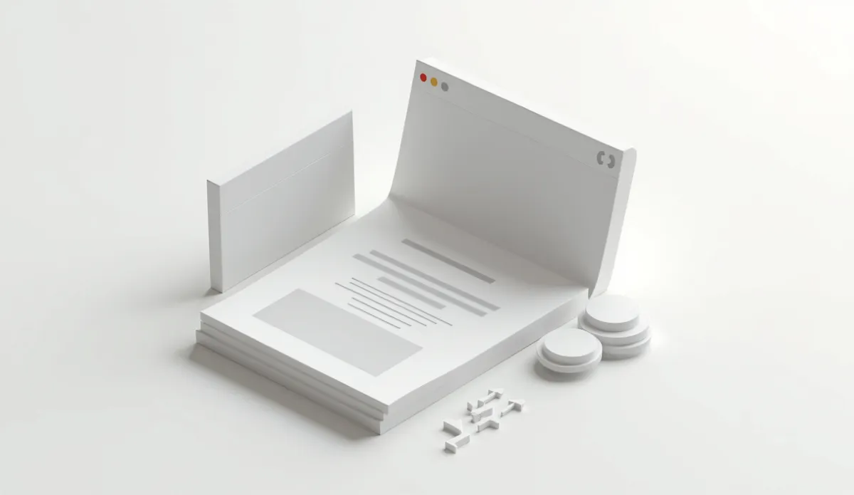
The highest-earning position for a native ad widget is directly below the article body, above any comment section or footer, sized to a single row of four to eight tiles; this single placement consistently outperforms sidebar, mid-article and above-the-fold placements because it catches readers at the exact moment they've finished consuming content and are deciding what to do next, rather than interrupting them mid-read or competing with content they haven't reached yet.
Why position beats almost everything else#
A content recommendation widget only earns when someone clicks it, and clicks depend on catching a reader in a decision moment. Below the article body is the single strongest decision moment on a page: the reader has finished the thing they came for and their next action (close the tab, keep scrolling, click something) is genuinely undecided. Every other position asks the in-feed widget to compete with something the reader is actively doing.
- Above the fold, before any content: technically the highest-visibility slot, but it interrupts intent before the reader has any reason to trust the page, and CTR is typically weak because nobody arrived to see recommendations before reading anything.
- Mid-article, inserted between paragraphs: can work for very long-form content (2,000+ words) as a secondary placement, but it competes directly with the article itself and can hurt read-through, which then hurts your primary ad slots further down the page.
- Sidebar: largely ignored on mobile (most publisher traffic today) and increasingly ignored on desktop due to banner blindness; native content-recommendation tiles specifically underperform here compared to in-feed positions because the format is built to look like content, and content doesn't live in sidebars.
- Below the article, above comments/footer: the strongest default. This is where Taboola, Outbrain, MGID and Revcontent widgets are shown in the large majority of ad placement integrations, and it's the position their own recommended implementations point to first.
Sizing and layout#
Widget width should match your article column, not stretch full-page-width past what feels like part of the content flow; a widget that looks pasted-on rather than native to the page design tends to get banner-blinded even in a good position. Four tiles in a single row works well for narrower article columns; six to eight tiles in a two-row grid suits wider layouts, but going much past eight tiles in one placement usually adds impressions without adding proportional clicks, since attention spreads thin across more options.
Image size matters more than most publishers assume: recommendation networks generally reward (with better fill and often better CPC) placements that render images at full quality rather than heavily compressed thumbnails, since image quality is part of what the auction's creative-quality signals weigh. Check your specific network's current spec documentation for recommended dimensions, since these change periodically.
Mobile-specific placement notes#
Mobile traffic dominates most publisher audiences now, and mobile changes the calculus in two ways. First, the below-article position is even more dominant on mobile since there's no sidebar option at all, meaning in-feed native placement effectively becomes the only real estate competing for that "what's next" decision. Second, sticky or auto-loading widgets that appear before a reader finishes scrolling the article tend to backfire, both on user experience and on the network's own quality scoring, which increasingly penalizes placements associated with high bounce or low dwell time.
One widget vs. stacking multiple positions#
Running a single well-placed widget below the article typically beats running two or three smaller widgets scattered through the page. Each additional widget position dilutes attention across more decision points, and most of the added impressions come at the cost of lower CTR per tile rather than genuinely new engagement. The exception is very long-form content, where a secondary mid-article insertion between major sections can add incremental revenue without cannibalizing the primary below-article slot, since the two placements are catching the reader at genuinely different moments (partway through vs. finished).
Common placement mistakes that quietly cost RPM#
- Placing the widget above a "read more" or pagination break. If your article splits across multiple pages, put the widget after the true end of the content, not after page one of a paginated split; readers who haven't finished the piece are far less likely to click a recommendation.
- Letting the widget render before the article's own images load. On slow connections, a widget that paints before the hero image finishes loading looks like it belongs to a different, slower page, and readers bounce before either loads fully.
- Matching widget tile images too closely to your site's own editorial photography style. This sounds counterintuitive, since blending in is usually good design advice, but native ad networks perform best when the tiles are recognizably a different, curated set of content, not indistinguishable from your own article thumbnails; readers need to register it as "more to explore," not confuse it with your site's own related-posts module.
- Ignoring viewability. A widget that loads far down a page most readers never reach won't earn regardless of position quality. Check your analytics for average scroll depth before finalizing a placement; if most sessions don't reach 80% scroll, your below-article widget may need to move up structurally, for instance by shortening filler content above it.
- Forgetting to re-test after a site redesign. A redesign that changes column width, font size or article length shifts scroll depth and reading time, which changes whether your existing widget position still lands at the right decision moment. Treat every redesign as a reason to re-run a placement test, not an assumption that the old position still works.
How placement guidance differs by network#
Taboola, Outbrain, MGID, Revcontent and MediaGo each publish their own recommended implementation, and while the below-article position is the common default across all of them, the specifics (minimum tile count, required spacing from other ad units, whether native and display placements can sit adjacent) vary and change over time. Check the specific network's current publisher documentation before finalizing tile counts or spacing, rather than assuming one network's spec applies to another; a layout that's compliant on Taboola may violate a spacing requirement on a different network entirely.
What changes for AMP and app-embedded pages#
AMP pages and app-embedded article views (Google Discover feeds, Apple News-style wrappers) often restrict where and how a widget can render, and some networks maintain separate AMP-specific tags with reduced customization. If a meaningful share of your traffic arrives through these surfaces, check your network's current AMP integration documentation directly rather than assuming your standard desktop placement carries over, since rendering behavior differs enough to matter for both fill rate and layout.
Testing placement changes properly#
Because RPM blends CTR, CPC and fill rate into one number, a placement change needs at least two to four weeks of stable traffic to read cleanly, and ideally an A/B split (some pages with the new placement, some with the old, same time window) rather than a straight before/after comparison, since traffic mix shifts week to week regardless of what you change on the page. Publishers who make a placement change and judge it off three days of data are usually reacting to noise, not signal.
Keep a simple log of what changed and when: date, page template affected, and the specific change (moved widget up 200px, added a second row, swapped tile count from four to six). Without that log, it becomes impossible to attribute a later RPM shift to the placement change versus a seasonal swing in advertiser demand or a traffic mix change from a viral post. Publishers running several templates (news article, review post, listicle) should test each template separately too, since the ideal placement on a 400-word news post is rarely identical to the ideal placement on a 3,000-word buying guide with a completely different scroll and read-time profile.
How OpenAdLibrary fits in#
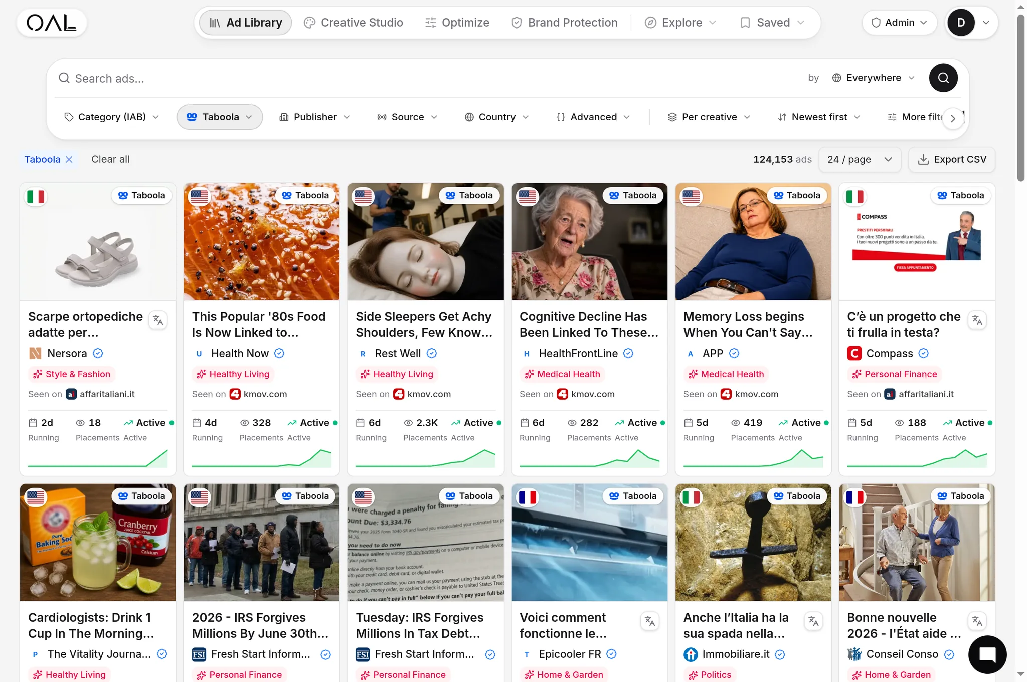
Before committing to a specific network's widget on your highest-traffic pages, it helps to see which advertisers are actually active on that network in your content's vertical right now, since a widget with weak advertiser demand behind it will underperform regardless of how well you place it. OpenAdLibrary's native ad spy tool lets you check live creative volume and advertiser mix per network before you decide where to route your best inventory.