 Español
 Português (Brasil)
 Français
 Deutsch
 Italiano
 Nederlands
 Polski
 Svenska
 Türkçe
 Русский
 日本語
日本語 한국어
한국어 简体中文
简体中文 Tiếng Việt
 Bahasa Indonesia
 繁體中文
繁體中文 Čeština
 Dansk
Dansk Norsk (bokmål)
 Suomi
Suomi Ελληνικά
 Română
 Magyar
 Українська
 ไทย
ไทย हिन्दी
 العربية
 עברית
עבריתTaboola Image Specs: The Practical Creative Cheat Sheet
The recommended dimensions, format and text rules for Taboola images, plus how the same creative crops differently on mobile vs desktop and what actually gets flagged in review.

Taboola's long-standing recommended image size is 1200x800px at roughly a 3:2 aspect ratio, saved as a JPG or PNG, with text kept to a small strip of the frame rather than plastered across it. Those numbers have held steady for years and are still the safest default, but ad specs are exactly the kind of thing platforms revise quietly, so confirm the current limits in Taboola's own spec documentation before a launch that matters.
This is the cheat sheet version: what to set your export presets to, how the image actually gets cropped once it hits a real feed, and which mistakes get creative rejected or just ignored by readers. If you want the bigger picture on how the network works first, see How Taboola Ads Work.
Core dimensions and aspect ratio#
1200x800px (3:2) is the number you'll see repeated across almost every native-ads guide, and for good reason: it's wide enough to read clearly in a desktop grid and tall enough to survive the crop into a mobile feed card without losing the subject. Anything close to 4:3 or 1:1 also tends to render fine, since most native widgets crop toward center rather than stretch.
What actually breaks is the extreme end of either axis. A banner-shaped image (very wide, short) gets cropped hard on mobile and often loses the headline element of the photo entirely. A tall portrait image gets squeezed the other way. If you're repurposing creative from a display or social campaign, don't just drop it in; re-crop to the native ratio first.
A minimum resolution somewhere around 800x800px is the widely cited floor. Below that, the image gets upscaled to fit the widget and starts looking soft, which reads as low-effort next to the publisher's own editorial photography sitting right beside it in the feed.
File format, weight and the text-on-image rule#
JPG and PNG are the accepted formats; PNG makes sense for graphics with hard edges (comparison charts, before/after splits), JPG for photography. Keep file weight modest. Nobody wants a multi-megabyte creative slowing down page load on a publisher's article, and slow-loading creative tends to get throttled by delivery systems that factor page performance into ranking.
Text-on-image policy is the one that trips up the most advertisers. Native networks generally want the photo to do the work, with text as a light accent rather than the whole message. Heavy text blocks, especially ones mimicking a headline or a "click here" button baked into the image, read as an attempt to disguise an ad as content, which is the kind of thing that gets creative flagged in manual review. If you want the copy to carry weight, put it in the actual headline field, not burned into the pixels. Our ad creative analysis breakdown covers how to score an image against copy separately rather than conflating the two.
How the image actually renders across placements#
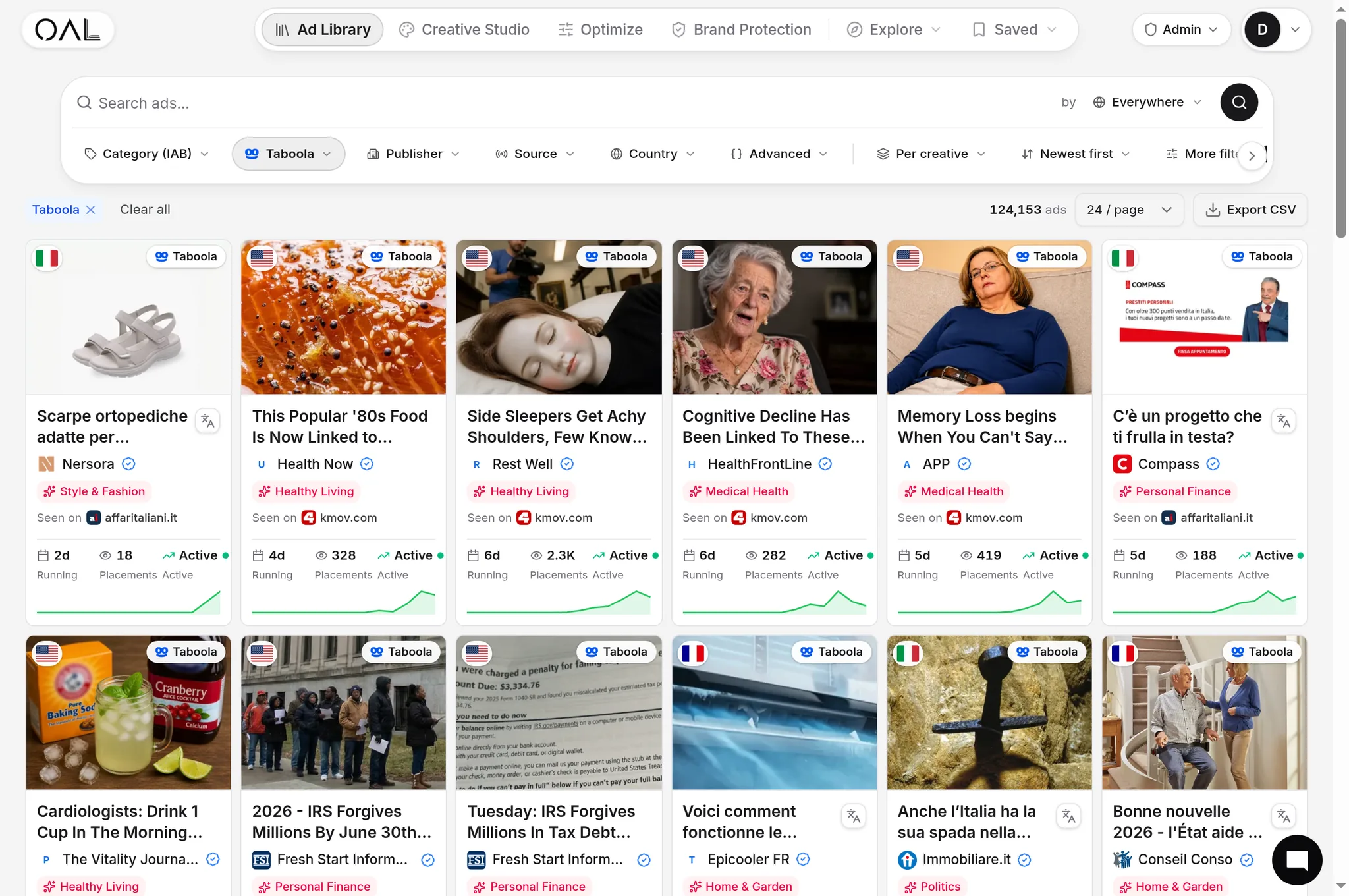
Here's the part most cheat sheets skip: the same creative renders differently depending on where it lands. Desktop grid widgets show a wider crop with more of the frame visible. Mobile feed cards, which carry the bulk of Taboola's volume, crop tighter and closer to a square, and the card itself is small relative to the phone screen. A face or product that's dead-center in your source image survives both crops; one that's off in a corner might get cut entirely on mobile.
This is also why so many high-performing native images across our index of 206,145 captured Taboola creatives lean on a single dominant subject, whether that's a face, a product shot, or a simple before/after split, rather than a busy scene with multiple points of interest. A busy image that reads fine on a 27-inch monitor can turn into visual noise once it's cropped down to a thumbnail on a 6-inch screen.
What winning images have in common#
Across the verticals that dominate Taboola volume in our index, health (11,982 creatives), finance (8,200), insurance (7,422) and ecommerce (5,185), the pattern is consistent: a single human face or a single product, shot plainly, without stock-photo gloss. Real-looking beats polished. A slightly imperfect phone photo of a hand holding a product routinely outperforms a studio shot in the categories we track most closely, likely because it doesn't visually announce itself as an ad the way agency photography does.
Contrast matters more than color. A subject that stands out clearly against its background survives the crop-and-shrink into a thumbnail; a subject that blends into a similarly toned background disappears. If you're testing multiple crops of the same source photo, that's a cheap way to find which framing holds up once it's actually small.
Common mistakes that get creative rejected or ignored#
A few patterns show up again and again in weak native creative:
- Recycled stock photography. The same handshake-and-laptop stock image has been run by hundreds of advertisers across dozens of networks; readers have seen it, consciously or not, and scroll past it.
- Misleading before/after composites. Exaggerated transformation images invite both compliance rejection and, if they slip through, brand damage when the offer doesn't match the promise. See our guide on FTC disclosure rules for advertorials and native ads for where the compliance line actually sits.
- Fake UI elements. Images designed to look like a phone notification, a play button, or a browser warning are a compliance red flag across every major native network, not just Taboola.
- Watermarks or borders. Leftover stock-site watermarks or a visible frame around the image signal low production effort and often get caught in creative review before they ever reach a feed.
- Low-resolution upscales. An image stretched past its native resolution to hit the 1200x800 target looks noticeably soft next to sharp editorial photography on the same page.
Sourcing images: photography vs stock vs AI-generated#
Where the image comes from matters almost as much as its dimensions. Original photography, even shot on a phone, tends to outperform licensed stock because it hasn't already been seen a thousand times across other advertisers' campaigns. If original photography isn't practical, deep-catalog or less common stock sources beat the same handful of front-page stock images every media buyer already reaches for first.
AI-generated images are increasingly common in native creative, and they pass technical review fine as long as they meet the same dimension and text rules as any other image. The risk is a different one: AI-generated faces and hands still carry subtle artifacts (odd finger counts, uncanny skin texture, text that isn't real text) that attentive readers notice even if they can't articulate why an image feels off. If you're using generated images, review them at actual display size, not zoomed in, since flaws that are obvious at full resolution often disappear once the image shrinks into a feed thumbnail.
Testing multiple crops and variants efficiently#
Rather than commissioning a brand-new photo for every test, it's often more efficient to take one strong source image and test multiple crops and framings of it against multiple headlines. A tight crop on a face, a wider crop showing context, and a product-only crop can perform very differently from the exact same underlying photo, and testing crop variations is far cheaper than sourcing entirely new imagery for every angle you want to try.
Keep a simple naming convention for your creative variants (source image, crop type, headline variant) so that when one combination wins, you know exactly which element to credit and which to keep iterating on. Sloppy naming is a small thing that costs real time once you're running a dozen active variants across a few verticals.
Vertical-specific creative patterns#
Image expectations shift by vertical in ways that aren't obvious until you've looked at enough live creative. Health and beauty ads in our index lean heavily on before/after framing and close-up product or skin shots. Finance and insurance creative leans more on lifestyle photography, a person at a kitchen table, a couple looking at documents, rather than product shots, since there's rarely a physical product to photograph. Home and garden ads, which carry thousands of live creatives in our index, tend to favor a single striking before/after or a surprising household object shot plainly against a neutral background.
Matching your creative style to what already works in your specific vertical, rather than applying a generic "good ad photography" template across every category, is one of the fastest ways to close the gap between a technically correct image and one that actually performs.
How OpenAdLibrary helps#
Rather than guessing what a strong Taboola image looks like in your vertical, you can look at what's actually running. The Taboola ad spy tool lets you pull live creative by vertical and geo and see the real image, not a thumbnail, alongside how long each one has survived. Longevity is the tell: an image that's still running after three or four weeks has cleared the bar readers actually judge by, which is a much better signal than any spec sheet. Our guide to analyzing winning native ad creatives walks through the full method for turning that data into your own testing shortlist, and 10 Taboola ad examples captured live shows the pattern in practice across formats.
FAQ#
Frequently asked questions about Taboola image specs.