 Español
 Português (Brasil)
 Français
 Deutsch
 Italiano
 Nederlands
 Polski
 Svenska
 Türkçe
 Русский
 日本語
日本語 한국어
한국어 简体中文
简体中文 Tiếng Việt
 Bahasa Indonesia
 繁體中文
繁體中文 Čeština
 Dansk
Dansk Suomi
Suomi Ελληνικά
 Română
 Magyar
 Українська
 ไทย
ไทย हिन्दी
 العربية
 עברית
עבריתWhy Ugly Ads Work: The Anti-Polish Effect in Native Feeds
A plain, almost boring native ad regularly outlasts a polished one. It isn't an accident of taste, it's a mismatch between what a native feed rewards and what a brand designer optimizes for.


A plain, almost boring native ad regularly outlasts a polished, brand-quality one, and it isn't an accident of taste. Native placements sit inside a feed of article thumbnails, not a gallery of other ads, so a creative that visually matches its surroundings reads as content rather than an interruption. A glossy lifestyle shoot with brand colors and a tagline reads as an ad the moment it loads, which is the one thing a native placement is built to avoid looking like.
What "ugly" actually means here#
Ugly doesn't mean broken, blurry or amateurish in a way that undermines trust. It means visually plain: a straightforward product photo instead of a styled lifestyle shoot, a screenshot-style layout instead of a designed graphic, ordinary lighting instead of a polished studio look, the kind of image you'd expect from a small local business rather than an agency-produced campaign. The creative angle can be sophisticated even when the image is deliberately unremarkable. What matters is that the image doesn't announce itself as marketing before the headline gets read.
Why the feed rewards this#
Every native widget is built to look like "more from this site" or "you might also like." Publishers design it that way on purpose, and readers have learned, consciously or not, to skim past anything that visually breaks from the surrounding editorial thumbnails. A studio-quality hero image with brand polish is exactly the kind of visual pattern readers have trained themselves to filter out, because it's the signature of an ad, not an article. A plain product photo or a simple before-and-after image doesn't trip that filter the same way.
This is a structural fact about the placement, not a claim about consumer taste in general. The same polished creative that gets ignored in a Taboola widget under a news article might perform perfectly well as a social ad in a feed where users expect brand content. Native's specific context, editorial surroundings, casual browsing intent, low expectation of being sold to, is what makes plainness an advantage rather than a liability.
Where this shows up in practice#
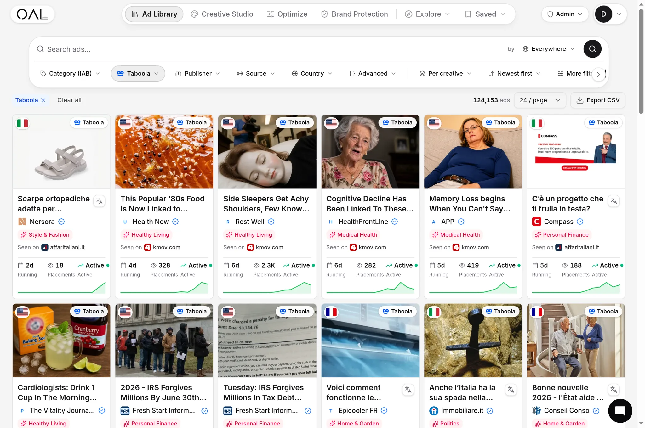
Look at what tends to survive longest in categories built on trust rather than aspiration. Home services, health information, and personal finance creative in our index skew plain rather than styled: a straightforward statement of a service or rate, a simple product shot, none of the visual signaling that says "premium brand." An MSN creative for Boots Hearingcare, "Discover comfortable and discreet hearing solutions at Boots," reads and looks more like a straightforward local business notice than a national ad campaign, and it had reached 38 days of continuous observation at capture, close to the ceiling of what we currently track. Compare that to categories where visual polish is itself part of what's being sold, fashion and premium ecommerce, where a styled product shot is doing real work the reader expects, not adding unwanted friction.
Why polish can actively backfire#
In trust-sensitive verticals, an overly polished ad creates a subtle mismatch: the reader is used to seeing slick marketing right before a scam, an overpriced upsell, or a claim that doesn't hold up. A plain, almost artless creative signals, intentionally or not, that this isn't a big marketing budget trying to manipulate you, it's just information. That's a genuine trust signal in categories like nutra, insurance eligibility, and local services, where the reader has been burned by glossy promises before.
This is also why a headline-first, image-second approach tends to win in these categories. Our guide on native ad creative best practices covers the order of operations: get the claim and the framing right before spending on production value, because production value is frequently the thing working against you here.
When to actually polish it up#
The anti-polish effect isn't universal, and treating it as a blanket rule is its own mistake. Ecommerce and fashion offers, where the product's look is the pitch, still benefit from clean, well-lit photography, because the reader is evaluating the product itself, not deciding whether to trust a claim about it. The line to watch for is whether the reader's decision hinges on trusting an assertion (health, finance, eligibility, services) or on liking what they see (apparel, home decor, gadgets). Trust categories favor plain. Taste categories favor polish.
Our breakdown of common native ad angles shows how this plays out across verticals in practice, and analyzing winning native creatives walks through scoring an image against its category rather than against generic design standards.
A practical way to apply it without guessing at "ugly"#
Rather than aiming for ugly directly, aim for whatever the surrounding publisher content looks like. Open the actual page your ad would run on, look at the article thumbnails around the widget, and match your creative's lighting, framing and level of polish to that baseline rather than to your brand's style guide. If your product photo would look at home as a stock photo inside a mid-market news article, it's probably calibrated correctly for the placement. If it would look at home in a fashion magazine spread, it's likely over-produced for a health, finance or services offer running in the same widget.
This also changes what you spend production budget on. Instead of a styled photoshoot, spend the time on getting the claim, the framing and the offer right, since those are what a trust-sensitive reader is actually evaluating. A native ad creative best practices approach that front-loads message clarity over visual production tends to produce exactly the kind of plain-but-effective creative this effect describes, often at a fraction of the production cost of a polished alternative.
Common mistakes when applying the anti-polish effect#
The first mistake is confusing plain with careless. A soft-focus, badly cropped, or genuinely low-resolution image undermines trust just as much as an over-produced one, for a different reason: it reads as low effort rather than as honest. The bar is a clear, in-focus, ordinary-looking image, not a bad one.
The second mistake is applying this blanket across every vertical without checking. Fashion, home decor and any product where visual appeal is the actual pitch don't benefit from deliberately plain photography, because the reader is evaluating whether they like the look of the thing, not whether to trust a claim about it. Forcing plainness there removes the one signal the reader actually wants.
The third mistake is assuming this is permanent. As more advertisers in a vertical adopt plainer creative because it works, a genuinely polished outlier can start to stand out again, for the opposite reason it used to fail: everyone else went plain, so polish becomes the pattern interrupt. Revisit the assumption periodically rather than locking in one visual style forever.
How to test this instead of assuming it#
Don't take this article's word for it in your specific vertical. Pull the currently live creatives in your category from a network like MGID, which historically carries a heavy mix of plain, direct-response style creative alongside more polished ecommerce ads, and sort by longevity. If the plainest-looking creatives are also the longest-running ones, that's your answer for this category today. If the opposite is true, don't force plainness onto a vertical where the visual quality is doing real conversion work.
The actual mechanism, restated#
None of this is about ads looking worse for its own sake. It's about matching the visual register of the creative to what the reader expects to trust in that specific placement and category. A feed built to look like editorial content rewards creative that doesn't visually contradict that framing, and in categories already crowded with slick promises, an unpolished ad can be the thing that reads as honest instead of manufactured. Test both, and let observed longevity, not an internal design review, tell you which one your specific audience actually believes.