 Español
 Português (Brasil)
 Français
 Deutsch
 Italiano
 Nederlands
 Polski
 Svenska
 Türkçe
 Русский
 日本語
日本語 한국어
한국어 简体中文
简体中文 Tiếng Việt
 Bahasa Indonesia
 繁體中文
繁體中文 Čeština
 Dansk
Dansk Norsk (bokmål)
 Suomi
Suomi Ελληνικά
 Română
 Magyar
 Українська
 ไทย
ไทย हिन्दी
 العربية
 עברית
עבריתNative Ad Image Sizes: The Cheat Sheet for Every Major Network
One master image, four crops, every major native network covered. The working image-size defaults for Taboola, Outbrain, MGID, Revcontent, MediaGo, MSN and Yahoo — plus the crop-survival rules that matter more than pixels.

There is no single native ad image size — every network crops your image to fit whatever widget each publisher runs. The practical answer: build one master image at 1200 px wide or larger with the subject centered in the middle 60–70% of the frame, then export four crops that cover virtually every major network — 16:9 for Taboola, 3:2 for Outbrain and MGID, 1.91:1 for MSN, MediaGo and Yahoo, and 1:1 for square feed slots. Design for aspect ratio and crop-survival, not for exact pixels, and you will pass spec on every network that matters.
The cheat sheet#
The table below lists the ratios to design for and the commonly documented recommended upload sizes as of mid-2026. Networks revise specs without ceremony, so treat this as your working default and verify against the network's current creative documentation before a big launch — Taboola's help center, Outbrain's advertiser resources and Microsoft Advertising's docs are the primary sources for the big three.
| Network | Design ratio | Commonly documented upload | Notes |
|---|---|---|---|
| Taboola | 16:9 | 1200×674 recommended | Wide crop; GIF/short-video "motion ads" run on many placements |
| Outbrain (Teads) | 3:2 | 1200×800 recommended, ~400×260 floor | Slightly taller than Taboola — a 16:9 master loses edges here |
| MGID | ~3:2 | Upload ≥600 px wide; crop in dashboard | The teaser cropper is where your framing survives or dies |
| Revcontent | 4:3 to 1:1 by widget | Upload ≥1000 px wide | Widget styles vary widely per publisher; check current docs |
| MediaGo | ~1.91:1 | Upload ≥1200 px wide | MSN-adjacent inventory; landscape-first |
| Microsoft Audience Network | 1.91:1 and 1:1 | 1200×628 and 1200×1200 | Supply both ratios — feeds pick per placement |
| Yahoo DSP (native) | 1.91:1 and 1:1 | 1200×627 and 627×627 (+180×180 icon) | Long-standing spec carried over from Yahoo Gemini |
| Teads (branded formats) | Varies by format | Landscape + square masters | Format-specific; check the current spec sheet |
Two things this table can't tell you: how your image survives each network's crop, and how small it renders in the wild. Those two factors kill more native creatives than any spec violation.
Aspect ratio beats pixels#
Native networks serve one creative into thousands of publisher templates. Your image will be rendered as a large card on one site, a 100-pixel-wide thumbnail in a sidebar content recommendation widget on another, and a mid-article in-feed unit on a third. The network's creative spec defines what you upload; the publisher's template defines what humans actually see.
That has three practical consequences:
- Center-weight everything. Crops eat edges first. If your product, face or focal object sits in the middle 60–70% of the frame, every ratio from 16:9 to 1:1 keeps it intact.
- Design for the thumbnail, verify at full size — not the other way around. An image that reads at 120 px wide (one subject, tight crop, strong contrast) also works at 1200 px. The reverse is rarely true.
- Upload big. Networks downscale gracefully but upscale badly. A 600 px upload that gets stretched onto a large card placement looks soft, and soft images read as low-trust. Start from source files at least 1600 px wide when you can.
The one-master-image workflow#
Producing per-network creatives from scratch is how teams end up with twelve inconsistent variants. Do it once, properly:
- Select or shoot at 1600 px+ wide, subject centered, background simple. Busy backgrounds die at thumbnail size.
- Apply the safe zone. Imagine a rectangle covering the central 60–70% of the frame — everything meaningful lives inside it. Nothing important within roughly 10–15% of any edge.
- Export the four working crops: 16:9 (1200×674), 3:2 (1200×800), 1.91:1 (1200×628) and 1:1 (1200×1200). That set satisfies the design ratios of every network in the cheat sheet.
- Preview at thumbnail size. Shrink each crop to ~120 px wide. If you can't tell what it is in half a second, neither can a feed scroller.
- Check the crop in each network's preview tool before launch — especially MGID's teaser cropper and MSN's dual-ratio feed preview, where auto-cropping surprises are most common.
Network-by-network notes#
Taboola: design wide, expect small#
Taboola's 16:9 recommendation is the widest working ratio in native, and its publisher base renders everything from hero-sized cards to dense multi-thumbnail grids. The composition that survives both extremes is a single subject filling 50–70% of the frame. Motion ads (GIF/short video) are a genuine differentiator on Taboola placements — subtle movement lifts attention in a static feed — but keep motion slow and loop-friendly; flashing or strobing gets rejected. Study how the network's mechanics shape creative in how Taboola ads work.
Outbrain: the 3:2 discipline#
Outbrain's 3:2 ratio is taller than Taboola's 16:9, and that difference is exactly where one-master-fits-all workflows break: a 16:9 image center-cropped to 3:2 loses its left and right edges. If you run both networks — most serious native buyers do — export both crops from the same master rather than letting either network auto-crop the other's file.
MGID and Revcontent: respect the cropper#
On the mid-tier networks, the dashboard cropping step is where creatives quietly die. Upload the largest source you have, then manually set the crop on every teaser rather than accepting the default — auto-crops routinely decapitate subjects or cut products in half. Widget styles vary more per publisher here than on the majors, so thumbnail-size legibility matters even more.
Microsoft Audience Network: feed both ratios#
MSN placements draw from both the 1.91:1 landscape and the 1:1 square asset. Advertisers who upload only the landscape image let the network synthesize the square — and an automated center-crop of a landscape composition is rarely the square you would have chosen. Build the 1:1 deliberately from the master. The MSN native ads guide covers the network's other quirks.
Yahoo and Teads: check before you build#
Yahoo's native spec (1200×627 plus 627×627 and a 180×180 icon) has survived multiple platform reorganizations since the Gemini era, but both platforms carry format-specific variations — confirm the current sheet for the exact placement type before producing finals.
Desktop vs mobile: where your image actually renders#
Most native inventory is consumed on mobile, and mobile is where images render smallest — often 100–140 px wide in stacked feed units below articles. Desktop placements (sidebar grids, end-of-article rows) render larger but earn less attention per impression. The asymmetry sets your design priority: if a creative only works at desktop card size, it fails on the majority of impressions it will actually receive. This is also why device-split testing matters — the same image can win on desktop and lose on mobile purely because fine detail vanishes at thumbnail scale.
Text, logos and overlays: keep them out of the image#
Native networks are protective of the editorial look of their feeds, and most restrict or reject images with heavy overlay text, added borders, fake play buttons, or interface elements that imitate the surrounding page. Policies differ in wording but converge in practice:
- Minimal or no text in the image. The headline field is where your words go; an image full of caption text gets rejected on some networks and cropped into gibberish on the rest.
- No misleading UI. Fake close buttons, fake video controls and screenshot-style chrome are broadly prohibited.
- Logos: small, inside the safe zone, or absent. A logo in a corner is the first thing a crop removes.
This is a real difference from social advertising, where text-on-image built an entire creative language. Creatives ported straight from Meta campaigns are the most common spec failure we see — square, text-heavy images that violate both the ratio and the overlay conventions of feed placements. If you're moving budget across, our guide to native ad creative best practices covers the full translation, not just sizing.
Formats, file weight and motion#
- JPEG and PNG are accepted everywhere. Use JPEG for photography (smaller files), PNG only where you genuinely need it.
- Keep files light. Networks re-compress on their CDNs, but a lean upload — a few hundred kilobytes rather than multiple megabytes — avoids quality-destroying double compression and helps in slow-network geos.
- Animated formats are network-specific. Taboola runs GIF/short-video motion ads on many placements; several other networks accept only static images. Never assume animation support — check the current spec, and always upload a static fallback.
- Upload the format the dashboard asks for, not the format the feed serves. Networks typically want JPEG or PNG at upload and then transcode to modern formats like WebP on their own CDNs. Converting your creative to WebP or other next-gen formats before upload buys you nothing and gets rejected by some upload validators — keep your masters as high-quality JPEG/PNG and let the network handle delivery optimization.
One more format note from the capture side: because networks re-encode aggressively for delivery, the version of your ad a user actually sees is often visibly softer than your upload. That is one more reason to start from an oversized, sharp master — compression artifacts compound, and a file that was marginal at upload is mush by the time it renders in a feed widget on a mid-range phone.
What real advertisers actually upload#
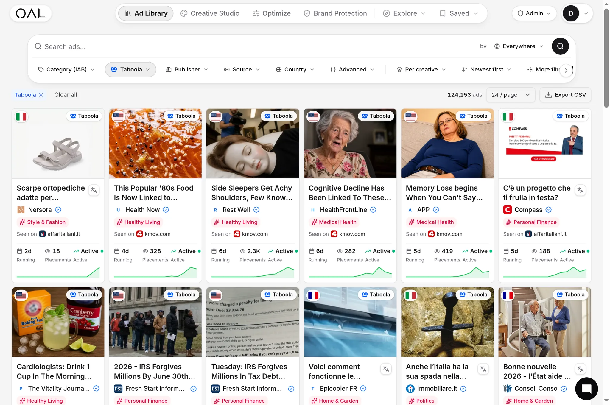
Specs tell you what's allowed; the live corpus tells you what wins. OpenAdLibrary stores the full-quality creative for 725,000+ live native ads across 49 networks (June 2026) — the actual files served in feeds, not screenshot crops — so you can inspect exactly how long-running advertisers compose inside these dimensions. Browse your vertical in the native ad spy tool and a few patterns are hard to miss:
- Long-running health and beauty creatives are overwhelmingly single-subject close crops — one face, one product, one body part — because those survive every ratio and stay legible at 100 px.
- Winning ecommerce images show the product in use at an angle, not a white-background catalog shot.
- The ads that persist for 30+ days almost never contain overlay text. Longevity is the quality filter here: an ad that keeps running is an ad that keeps paying, as covered in our ad longevity analysis, and studying live Taboola ad examples at full quality beats reverse-engineering compressed thumbnails.
When a competitor's creative has run for a month, its composition choices — crop tightness, subject placement, background treatment — are validated at exactly the sizes in the cheat sheet above. Steal the composition logic, not the image.
The corpus distribution is also a useful sanity check on where sizing effort pays off: the Microsoft Audience Network is the largest single-network corpus in the index at 281,839 live creatives, with Taboola at 206,145 and Outbrain at 108,573 (June 2026). If those three carry your budget, the 1.91:1 + 1:1 pair and the 16:9/3:2 pair between them cover the overwhelming majority of impressions you will ever buy — which is exactly why the four-crop master workflow exists.
Pre-flight QA checklist#
Run every new creative through this list before it spends money:
- Master source ≥1600 px wide, subject centered in the middle 60–70%
- All four crops exported (16:9, 3:2, 1.91:1, 1:1) — no network left to auto-crop another network's file
- Legible at 120 px wide in half a second
- No overlay text, borders, fake UI or edge-critical detail
- Manual crop set in MGID/Revcontent dashboards; both ratios uploaded to MSN
- Static fallback uploaded wherever motion is used
- File weight in the hundreds of kilobytes, not megabytes
- Previewed in each network's own preview tool, on mobile first
Common sizing mistakes#
- One square master for everything. A 1:1 image force-cropped to 16:9 loses a third of its content — usually the third with your product in it.
- Upscaled source files. Enlarging an 800 px image to meet a 1200 px recommendation produces soft, low-trust creative. Go back to the source.
- Critical detail at the edges. Prices, faces and products near the border are the first casualties of publisher-side cropping.
- Letterboxing to dodge crops. Padding an image with bars to preserve its ratio reads as broken in a feed and violates some networks' border policies.
- Testing headlines while ignoring crops. Teams A/B test copy endlessly, then ship one image render untested across placements where it's cropped three different ways. When performance diverges between networks with the same creative, check the crop before blaming the audience — and rotate before creative fatigue sets in, because even a perfectly sized image decays with exposure.
- Trusting a spec sheet from a year ago. Networks revise minimums, add ratios and retire formats without announcements. A cheat sheet — including this one — is a working default, not a contract; recheck the official documentation whenever a rejected upload or an oddly cropped render doesn't match what you expected.
The 30-second version#
Design at 1200 px+ with a centered subject; export 16:9, 3:2, 1.91:1 and 1:1; keep text out of the image and detail out of the edges; preview at thumbnail size; verify animation support per network; and calibrate against what long-running advertisers in your vertical actually upload. Sizes change — the crop-survival discipline doesn't.