High-Converting Advertorial Landing Pages: Anatomy + Real Examples
Advertorials convert when the page resolves the exact tension the ad created, so here's the seven-section anatomy with teardowns pulled from live native captures, not stale swipe files.

Most advertorial advice stops at "write like a magazine article." That's not why these pages convert. An advertorial wins when its structure resolves the exact tension the ad created, and when the reader never feels the seam between the headline they clicked and the page they landed on. Get the architecture wrong and even brilliant copy bounces. Get it right and a mediocre product can run profitably for weeks.
This is a teardown, not a pep talk. We'll break down the anatomy section by section, show what each part actually does to the reader, and pull patterns from real advertorial pages fed by live native advertising. For context on scale: we've captured 589,036 creatives and traced 926,259 landing pages across 42 networks (OpenAdLibrary index, June 2026). That's the kind of evidence a swipe file someone screenshotted two years ago can't give you.
What is an advertorial landing page?#
An advertorial landing page is an editorial-styled page, built to read like a news article, blog post, or first-person story, that pre-sells a product before handing the reader to a checkout or offer page. It sits between the ad and the sale, warming cold native traffic with narrative instead of a hard pitch. Because it mimics content, it has to carry a clear advertising disclosure to stay compliant.
The format earns its keep on native traffic specifically. Someone scrolling a native ad widget under a news article is in a reading mindset, not a buying one. A direct product page feels like a record scratch. An advertorial keeps them in the same posture, reading, long enough to build the desire a checkout page assumes you already have. If you want the upstream context first, our pillar on what a pre-lander is and how advertorial funnels work maps the whole journey.
Where does this structure show up most? Follow the money. Across our index, finance leads with 17,232 creatives, followed by insurance (15,629) and health (14,895), with ecommerce close behind at 13,872 (OpenAdLibrary, June 2026). Those are exactly the verticals where the buyer needs convincing before the offer makes sense, which is why advertorials cluster there. On Taboola alone, health (6,048 creatives) and finance (5,558) are the two biggest categories we track.

That IRS ad is a textbook advertorial feeder. It promises something specific and time-bound ("Forgives Millions By June 30th Tax Deadline"), and it does not try to close the sale. It sells the click. The page behind it has one job: pay off that exact promise before asking for anything.
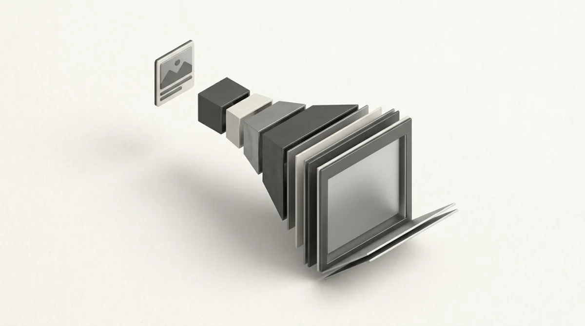
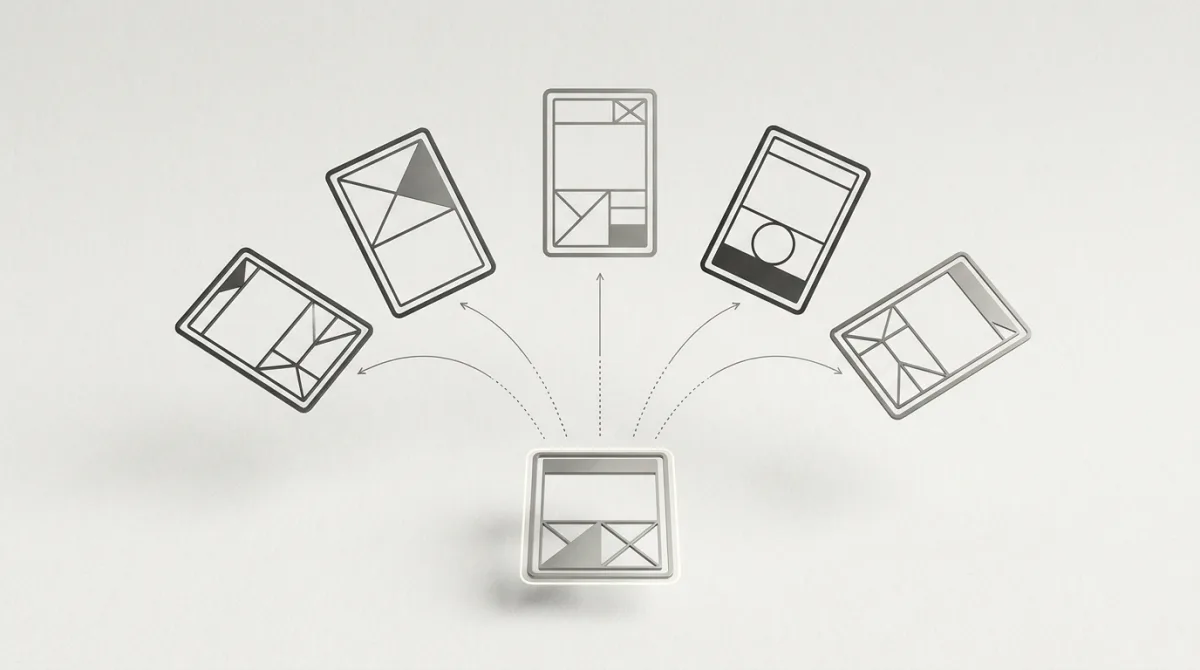
The anatomy: seven sections that do real work#
Strip away the topic and almost every high-performing advertorial runs the same skeleton. Each section has one job. When a page underperforms, it's usually because one of these is missing or out of order.
| Section | The reader's question it answers | Failure mode |
|---|---|---|
| 1. Hook / headline | "Is this the thing I just clicked?" | No message match, reader bounces in 2s |
| 2. Credibility frame | "Who's telling me this, and why trust them?" | No byline, no source, feels like spam |
| 3. The story | "Is this person like me?" | Jumps to product before earning attention |
| 4. Problem + agitation | "Do I actually have this problem?" | Names the product too early |
| 5. The discovery / mechanism | "Why would this work when nothing else did?" | Vague claims, no plausible "why" |
| 6. Product reveal + proof | "Is this real? Has it worked for others?" | Proof feels staged or generic |
| 7. CTA + urgency | "What do I do, and why now?" | Multiple competing CTAs, or none |
1. The hook, and the message-match contract#
The single biggest lever isn't the headline's cleverness. It's continuity with the ad. The ad made a specific promise ("Aussie retirees are using this app to cut power bills"). The first thing on the page must visibly pay that promise off, ideally echoing the ad's exact phrasing and image. This is the message-match contract, and breaking it is the most common reason advertorials with great traffic still lose money.
When the ad headline and the advertorial's opening line don't share the same words, image, and promise, you're paying for clicks and then asking those clicks to re-qualify themselves. Most won't.
You can audit this directly. Pull a native ad and the page it points to side by side, and the strongest funnels show near-verbatim phrase overlap between the creative and the page's first screen. The weakest show a generic "Welcome to our blog" header. That's money lit on fire.
2. The credibility frame#
Right under the hook, winning advertorials establish who is speaking. A named author, a publication-style masthead, a date, a "reviewed by" line. This is also where the disclosure lives, and where a lot of pages cut corners they shouldn't.
3. The story#
The narrative open ("Last winter I almost gave up...") exists to do one thing: make the reader recognize themselves. The protagonist should mirror the target avatar's situation closely enough that the reader keeps going to find out what happened. Notice that the product is not here yet. Pages that name the product in paragraph two convert worse because they break the editorial spell before trust is built.
4. Problem and agitation#
Before the solution, the page deepens the problem: the failed alternatives, the frustration, the stakes. On native traffic this matters more than on search traffic, because the reader didn't come looking for a solution. They were interrupted. The agitation manufactures the demand the checkout page will later assume.
5. The discovery and the mechanism#
The turn. The protagonist finds something, and crucially, the page explains a plausible mechanism for why it works. "A little-known compound." "A loophole in the way carriers bill." "A method physios use but don't advertise." The mechanism is what separates a believable advertorial from a hypey one. It gives the skeptical reader permission to believe.

Look at the curiosity engine in that headline: "MDs Identify 10 Medications Now Attached to Memory Problems In Seniors (See the List)." It implies authority (MDs), a concrete payload (a list of 10), and a personal stake. The page behind it lives or dies on whether it delivers a believable mechanism for why those drugs matter, before it ever names a supplement.
6. Product reveal and proof#
Only now does the product get named, and immediately it's wrapped in proof: before/afters, specifics, reviews, numbers. The reveal feels earned because the previous five sections built toward it. Strong pages keep proof concrete and checkable. Weak ones lean on stock-photo testimonials that experienced readers, and increasingly regulators, see straight through.
7. CTA and urgency#
One offer, one button, repeated. The best advertorials carry a single CTA that appears a few times as the reader scrolls, with honest scarcity (a genuine discount window, real stock limits) rather than a fake countdown that resets on refresh. Where the page leads next, a quiz, a checkout, a bridge page to the merchant, is itself a design decision worth studying across competitors.
A real teardown: the "personal discovery" advertorial#
Here's the pattern as it shows up in the wild, abstracted from advertorials we've captured running on Taboola and Outbrain placements. Health, finance, and supplement offers lean on this structure hardest, which tracks with the data: those three verticals account for tens of thousands of the creatives in our index.
- Ad creative: native image of an ordinary-looking person, headline framing a surprising result ("This Melbourne mum dropped her energy bill 40% with one phone setting").
- Hook: the page's H1 reuses "Melbourne mum" and "40%," with the same photo. Message-match contract honored.
- Frame: styled as a consumer-affairs column, with a byline and a "Sponsored" disclosure at the top.
- Story to agitation: her bill-shock story, the call-center runaround, the comparison sites that didn't help.
- Mechanism: a specific, plausible reason the trick works (an opt-in tariff most people never toggle).
- Reveal + proof: the app or service named, screenshots, a few specific savings figures.
- CTA: a single "Check your eligibility" button repeated three times, leading to the merchant's offer page.

That solar ad ("Solar home batteries: Electricians agree about 1 thing") is the energy version of the same template. It dangles a mechanism ("electricians agree about 1 thing") without revealing it, which forces the click. And it's been running 27 days straight in our index, which is the real tell. What makes this teachable is the match between ad and page. You're not guessing whether the funnel is coherent. You can see the creative and the page it resolves into. That ad-to-page coherence is the diagnostic, and our walkthrough on analyzing a competitor's full ad funnel goes deeper on reading the whole chain end to end.
Three advertorial formats worth modeling#
The "personal discovery" story is the most common, but it's not the only structure that wins. The right one depends on offer type and how skeptical the audience is.
- The investigative / consumer-report format. Reads like a watchdog exposing an industry. Works for finance, insurance, and "stop overpaying" offers where the enemy is a faceless incumbent. The "Australians looking for life insurance should read this" angle below is exactly this play: it frames the page as a warning, not a pitch.
- The listicle advertorial. "5 things every homeowner should know before..." The product is one item on the list, positioned as the obvious pick. Lower trust burden, easier to write, often paired with a quiz step downstream.
- The expert / authority format. Framed around a doctor, analyst, or specialist. Higher proof requirement, but converts well for considered purchases. For more on how these map onto native specifically, see our breakdown of pre-lander formats that win on native traffic.

Choosing a format is really choosing how much skepticism you have to overcome before the reveal. Match it to the offer and the temperature of the traffic, then study how the page flows into the offer in a complete ad to pre-lander to offer funnel.
What "long-running" actually means in our data#
A quick honesty note, because the industry loves to throw around "90-day winners" as if that's a measured fact. It usually isn't. The "a great advertorial runs for 90 days" line is general industry lore, not something most tools can verify. Treat it as a rule of thumb, not evidence.
Here's what we can verify. Our index tracks continuous observation per creative, and right now the longest-running ads we're watching have been live for about 28 days straight. Those include SmartAsset's "Ask a Pro: How Can I Avoid Paying Taxes on IRA Withdrawals?" on Outbrain (a finance advertorial feeder, 28 days) and Hidden Hearing's next-gen hearing-aid ads on the Microsoft Audience Network (28 days). A creative still serving after four weeks is the closest public proxy you get for "this funnel is profitable," because nobody keeps paying to run a loser. When you study a competitor, longevity plus placement spread tells you more than the prettiest screenshot ever could.
The compliance line you don't want to cross#
Advertorials live or die on a believability that's adjacent to deception, which is exactly why disclosure isn't optional. The FTC's native-advertising guidance is blunt: content that promotes a product but isn't readily identifiable as an ad can be deceptive, and the disclosure has to be clear and conspicuous in the context of the whole page. The agency specifically discourages vague labels like "Promoted" and points to clearer terms such as "Ad," "Advertisement," or "Sponsored advertising content." In the EU, the Digital Services Act (Article 26) requires platforms to let users identify, in real time, that something is an ad and who's behind it.
The practical read: a real disclosure near the top costs you almost nothing in conversion and removes a whole category of risk. Fake bylines, invented endorsements, and "as seen on [logo wall]" claims that aren't true are what draw complaints and takedowns. Our FTC disclosure rules for advertorials and native ads covers the specifics worth getting right before you scale spend.
A related trap is the copycat landing page, cloning a competitor's advertorial wholesale. Beyond the legal exposure, it skips the part that actually makes the original work: the message match to their ad, on their audience. Model the structure, write your own page.
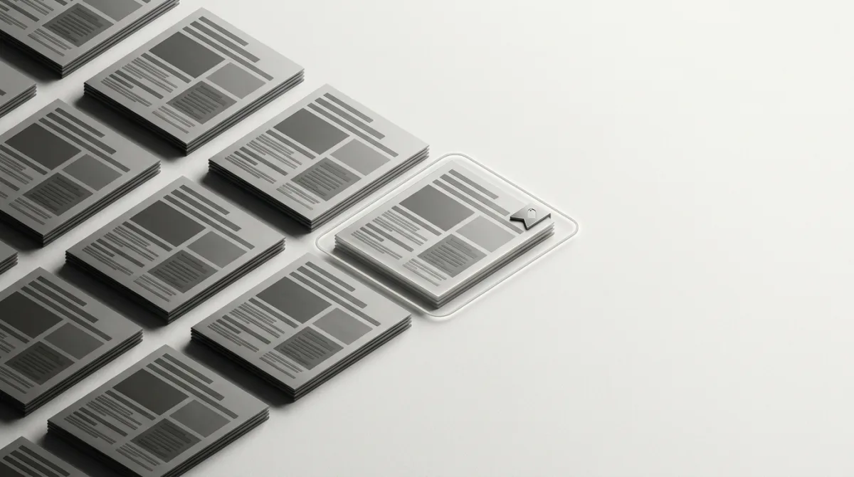
How to study real advertorials (and why captures beat swipe files)#
Most "advertorial example" roundups show you a screenshot and a caption. That's evidence of what a page looked like, not whether it worked or what ad fed it. To reverse-engineer a converting funnel you need three things a screenshot can't give you:
- The ad that drove the traffic, so you can judge message match instead of guessing at it.
- The landing page it actually resolved to, captured as it ran, not a year-old archive.
- Longevity and spread, how long the creative has been live and across how many placements, which is the closest public proxy for "this is profitable."
This is where pulling from live captures changes the work. OpenAdLibrary captures public native ads across Taboola, Outbrain, MGID, Revcontent and more (157,727 Taboola creatives, 84,252 Outbrain, and 49,689 MGID in the index as of June 2026), grabs the real creative at full quality, classifies the ad-tech supply chain behind it, and follows each click to the advertiser's landing page without clicking the live ad. So you see the ad and the advertorial it leads to, side by side, with how long it's been running. A winner that's been live for four weeks across dozens of placements is telling you something a screenshot never could.
If you want to start from a known competitor and trace forward, the method in how to find and analyze competitor landing pages from native ads walks through it, and the native ad spy tool is built around exactly this ad-to-page workflow.
Build your advertorial from evidence#
The fastest way to a converting advertorial isn't a template. It's a stack of proven structures from offers like yours, read against the ads that fed them. Map five live advertorials in your vertical: note the format, where the product is revealed, the mechanism, the CTA, and how tightly each page matches its ad. The patterns that show up across multiple long-running winners are your blueprint.
Start free and browse live native ads and the landing pages they point to, no card required, so you can see the ad-to-page match for yourself before you write a word.
Sources: