
 Español
 Português (Brasil)
 Français
 Deutsch
 Italiano
 Nederlands
 Polski
 Svenska
 Türkçe
 Русский
 日本語
日本語 한국어
한국어 简体中文
简体中文 Bahasa Indonesia
 繁體中文
繁體中文 Čeština
 Dansk
Dansk Norsk (bokmål)
 Suomi
Suomi Ελληνικά
 Română
 Magyar
 Українська
 ไทย
ไทย हिन्दी
 العربية
 עברית
עבריתPre-Lander Templates: 6 Proven Structures to Copy
Nearly every profitable native pre-lander is built on one of six structures. Here is the block-by-block skeleton for each — hook, mechanism, proof, CTA — plus decision criteria for matching template to offer.

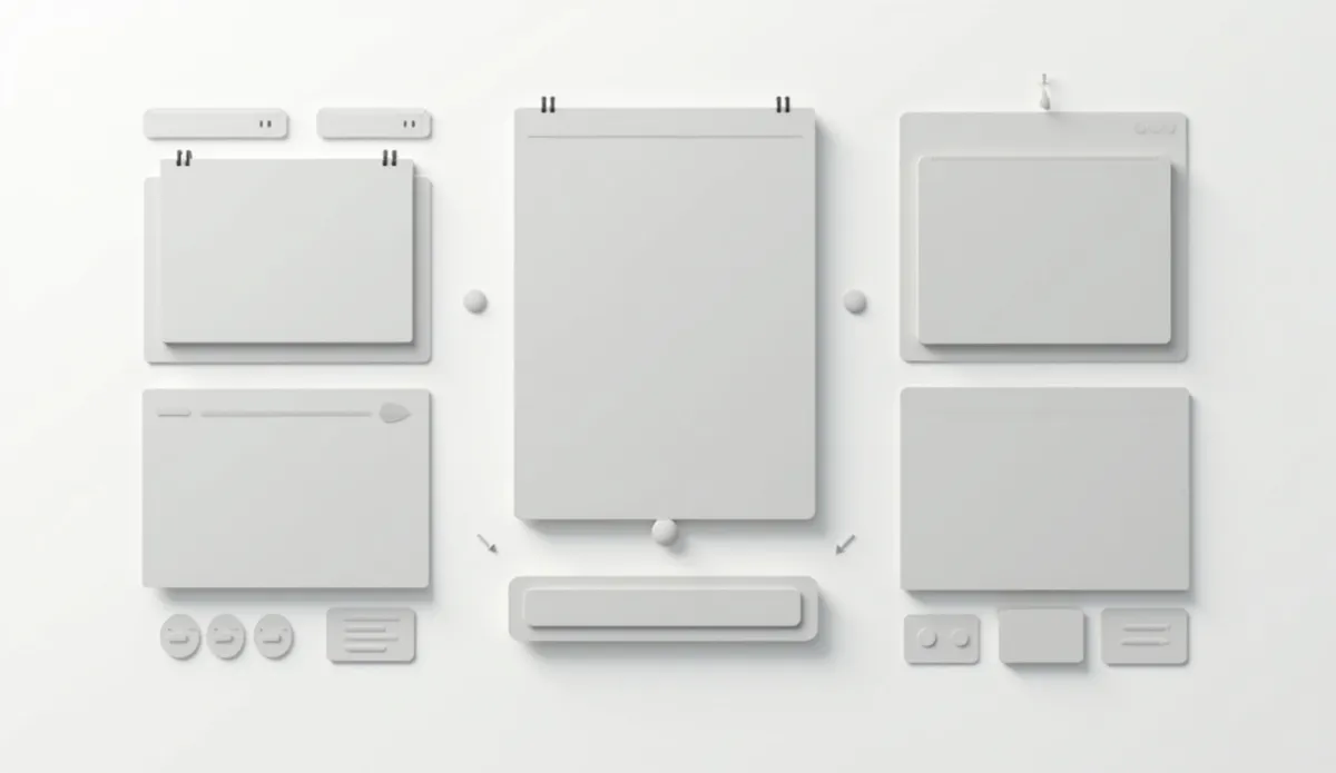
A pre-lander template is a reusable page skeleton that sits between your native ad and your offer page, structured to warm cold traffic before it sees a pitch. Six structures cover nearly every profitable pre-lander running on native networks right now: the first-person advertorial, the authority advertorial, the listicle, the quiz, the comparison roundup, and the news-style bridge. Each is a fixed sequence of blocks — hook, failed alternatives, mechanism, proof, objection handling, call to action — and you can rebuild any of them for a new offer in an afternoon. This guide gives you the block-by-block skeleton for all six, the offers each one fits, and the mistakes that quietly kill them.
Why pre-landers follow templates#
A pre-lander exists because native clicks are colder than almost any other paid traffic. The person who clicked your ad was reading an article about something else. They did not search for your product, they do not know your brand, and they have no purchase intent yet. Sending that click straight to a checkout page wastes it. The pre-lander's job is to convert curiosity into intent: qualify the visitor, build belief in a mechanism, and hand the offer page a warmer prospect.
Structures repeat because the persuasion sequence repeats: interrupt, identify, agitate, explain, prove, ask. Every template below is a different packaging of that same sequence, tuned to a different reader mindset. If you want the conceptual grounding first, read what a pre-lander is — this article is the buildable version.
There is a second, less obvious reason to work from templates: native networks review your funnel as a unit. A page structure that thousands of advertisers have run cleanly is a known quantity to a reviewer. A hand-rolled structure that accidentally resembles a fake news page is not, and it will collect rejections that have nothing to do with your offer.
Template 1: The first-person advertorial#
The workhorse of native advertising: a named narrator tells the story of a problem, the things that failed, and the discovery that fixed it. Best for nutra, beauty, home gadgets, and any offer where the buyer needs to believe "someone like me had this exact problem."
The skeleton, block by block:
- Headline — personal outcome plus built-in skepticism: "I Thought My Knee Pain Was Permanent. Then a Nurse Told Me About This." The skepticism matters; it pre-empts the reader's own.
- Narrator establishment (2–4 sentences) — who they are, plus one concrete detail that makes the low point real. Specific beats dramatic: "I stopped taking the stairs at work" lands harder than "my life was ruined."
- Failed-alternatives block — a short list of everything the reader has already tried (creams, pills, stretches). This is the qualification step: the target reader nods along and self-identifies; everyone else bounces cheaply.
- The discovery moment — a credible source introduces the solution: a relative, a physical therapist, a forum thread. Never a celebrity endorsement you cannot document.
- Mechanism paragraph — why this works when the others didn't, in plain words, one paragraph. The mechanism is what separates an advertorial from a bare testimonial; it gives the reader a new reason to believe.
- Results timeline — day 3, week 2, week 4. Keep claims soft and personal ("I noticed," "for me") rather than promissory.
- Objection block — price, skepticism, "is this a gimmick," raised and answered in the narrator's voice before the reader raises them.
- Call to action with real urgency — the offer link plus whatever scarcity is actually true: a current discount, verifiable stock status. Fabricated countdowns are a compliance liability, and networks increasingly detect them.
Typical length: 800–1,500 words. Common failure modes: over-claiming results (the fastest route to an account review), a narrator photo that is an obvious stock image, and a missing ad disclosure — an advertorial must be labeled as advertising, which we cover in the FTC disclosure rules for advertorials.
Template 2: The authority advertorial#
The same advertorial format with a different voice: an expert explains why everything the reader has tried fails, then reveals the real mechanism. Best for health, finance, and any vertical where the reader has been burned before and wants a credentialed explanation instead of another stranger's story.
The skeleton:
- Credential headline — "A Retired Podiatrist Explains Why Insoles Never Fixed Your Foot Pain."
- Contrarian premise — conventional solutions fail for a structural reason nobody talks about. This reframe is the hook; it converts frustration into curiosity.
- The educational middle — 300–500 words of genuinely useful explanation. This section earns the pitch, and readers can tell when it's filler.
- Evidence block — if you cite research, cite real, checkable research and link it. If you can't, don't invent it: fabricated studies are simultaneously an FTC problem and a network-ban problem.
- "What to do about it" — usually three steps. The first two are honest free advice; the third introduces the product as the practical implementation of the mechanism.
- CTA and disclosure — same rules as Template 1.
Expert-authority framing dominates native ad copy for a reason — scan any batch of live health ads and you will find specialist-framed hooks everywhere (we break the anatomy down in hook vs angle vs claim). Two hard rules: the expert must be a real, identifiable person who actually endorsed the content, and the credential must be real. Invented personas are the single most common reason advertorial funnels get taken down.
Template 3: The listicle#
A numbered list that carries the reader to an offer. Best for ecommerce products, broad-audience offers, and content-style angles where a story would feel heavy.
The skeleton:
- Numbered-promise headline — "7 Reasons Your Windows Streak (No. 4 Surprises Everyone)."
- Two-sentence frame — why this list exists and why now. No long intro; the number in the headline already set the contract.
- Items ordered by curiosity, not importance — the strongest hook item goes first to reward the click, the offer item sits at a pivot slot (commonly #1 of a countdown or item 3 of 7).
- The offer item gets 2–3× the depth of the other items, plus its own call to action.
- Repeat CTA every three items on longer lists — mobile readers rarely reach the end.
- Closer — restate the top pick and link it one final time.
Typical length: 600–1,200 words, each item a subhead plus 60–100 words and an image. Failure modes: pure content with the offer bolted on (readers churn before reaching it), every item selling something (reads like a catalog and converts like one), and item counts so high the page becomes a scroll marathon on a phone.
Template 4: The quiz#
An interactive qualifier: the visitor answers a handful of questions and receives a "personalized" result that is, structurally, the pitch. Best for weight loss, skincare, insurance and home-services lead gen, and finance offers where segmentation changes the message.
The skeleton:
- Qualifying-question headline — "Which Sleep Type Are You?" or "Do You Qualify?"
- 3–7 single-choice questions, one per screen. Each tap is a micro-commitment that raises completion odds.
- Progress indicator — visible momentum keeps people finishing.
- An "analyzing your answers" beat — a short pause that makes the result feel computed rather than canned.
- The result page is the pitch, mapped to the visitor's answers: the angle they told you applies to them is the angle they see.
The quiz's real power is self-segmentation — the result page can match message to admitted problem with a precision static pages can't reach. Instrument per-question drop-off: a question that loses a disproportionate share of visitors is confusing or too personal, and cutting it usually lifts completion more than any design tweak. Failure modes: quizzes longer than seven questions, generic result pages that ignore the answers (the whole point, wasted), and demanding an email before showing any value to cold traffic.
Template 5: The comparison roundup#
A "best of" review page that ranks several options and sends the reader to the winner. Best for software, VPNs, supplements, and insurance-style lead gen — anywhere buyers comparison-shop by default.
The skeleton:
- Superlative headline with a count — "We Ranked the 5 Best Standing Desks for Small Apartments."
- One-line methodology — what you compared and why the ranking deserves trust.
- Ranked review cards — name, one-line verdict, pros, cons, rating.
- The #1 pick gets 2–3× the space, a badge, and any live discount.
- A comparison table for the scanners who skip prose entirely.
- Affiliate disclosure — on review-style pages the material-connection disclosure is not optional.
Failure modes: five picks that all link to the same product (readers notice, and so do network reviewers), cons that aren't really cons ("almost too effective"), and rankings with no stated basis.
Template 6: The news-style bridge#
The shortest form — a bridge page of 300–600 words framed as a development worth knowing about: a new device category, a rate change, a program certain households qualify for. One column, minimal navigation, single CTA.
The skeleton:
- Discovery-framing headline — "A New Kind of Hearing Device Is Quietly Winning Over Skeptics."
- What changed — two or three paragraphs on the development itself.
- Why it matters to the reader — the practical benefit, stated plainly.
- Who it's for — the qualification paragraph that filters the click.
- Single call to action.
This template sits closest to the policy line, so the guardrails matter more than the copy: no fake news mastheads, no implied editorial independence, no dynamically inserted city names faking local coverage, no celebrity imagery without documented permission. Networks police this format hardest because bad actors abuse it most — expect stricter review, and keep the framing at "newsworthy development," never "news report."
Which template fits your offer#
| Offer type | First choice | Second choice | Typical length |
|---|---|---|---|
| Nutra / supplements | First-person advertorial | Authority advertorial | 800–1,500 words |
| Health devices | Authority advertorial | News-style bridge | 700–1,200 words |
| Beauty / skincare | First-person advertorial | Quiz | 800–1,500 words |
| Ecommerce gadgets | Listicle | First-person advertorial | 600–1,200 words |
| Software / VPN | Comparison roundup | Listicle | 1,000–1,800 words |
| Lead gen (insurance, solar, home services) | Quiz | News-style bridge | 5–7 questions / 300–600 words |
| Finance offers | Authority advertorial | Comparison roundup | 800–1,400 words |
Two rules of thumb sit behind the table. The more skeptical and previously burned the audience, the more the template needs mechanism and authority — which is why health and finance lean advertorial. The more impulse-driven the purchase, the shorter and more visual the template — which is why ecommerce leans listicle. When in doubt, match the structure that is already surviving in your vertical; that is a research task, and it comes last for a reason.
The blocks every template shares#
Whichever skeleton you pick, the winners share the same fundamentals:
- Message match. The pre-lander's opening must continue the exact promise of the clicked ad. A visitor who clicked a headline about streaky windows should land on a page about streaky windows, in the first sentence.
- One goal. Every link on the page points at the same offer. Site navigation, footer links and outbound citations leak motivated clicks.
- Mobile-first. Most native inventory is mobile; design for a 375-pixel screen and let desktop be the adaptation.
- Speed. Native clicks are impulse clicks. Compress images, drop heavy scripts, and treat every second of load time as paid traffic evaporating.
- Proof next to the claim. Testimonial, demonstration or citation adjacent to the assertion it supports — not pooled in a graveyard at the bottom.
- Disclosure above the fold, on every template, every time.
- A CTA that appears at least twice — after the mechanism, and at the end.
Adapting a template without breaking it#
Templates fail when people treat them as decoration instead of sequence. The order of blocks is the persuasion logic — you can swap what fills a block, but reordering blocks usually breaks the argument. A mechanism explained before the reader has self-identified is a lecture; a CTA before belief is a beg.
Iterate one block at a time against a control. Headline first — it moves more than everything else combined. Then the lead (narrator establishment or contrarian premise). Then the mechanism paragraph. Image changes ride along with headline tests. Keep the losing variant archived with its numbers; on native traffic, angles that lose in one geo or on one device class often win in another, and a documented loser is a free hypothesis later.
Copy structures from live funnels, not from memory#
Every template above is observable in the wild, running right now — and the versions that have survived weeks of spend are the ones worth modeling. Ad longevity is the closest thing native advertising has to a public profitability signal: nobody keeps paying for a losing funnel for a month.
The workflow: pick your vertical, find advertisers whose ads have been live for three weeks or more, and walk each funnel from creative to pre-lander to offer, noting which of the six templates they run and what they customized. OpenAdLibrary indexes 725,000+ live native creatives across 49 networks with 1.3 million+ captured landing pages (June 2026), so you can pull up the actual pages behind competitors' ads instead of guessing — start with the native ad spy tool and filter to your vertical and geo. For annotated live specimens, see pre-lander examples from native traffic and these advertorial landing page breakdowns; for how the pre-lander fits the full economics of the funnel, read landing page funnels for native traffic.
Build the skeleton from the template, steal the structural choices from funnels with proven spend, and write the copy for your own offer. That order — structure first, observation second, copywriting last — is what makes pre-landers repeatable instead of a coin flip.