 Español
 Português (Brasil)
 Français
 Deutsch
 Italiano
 Nederlands
 Polski
 Svenska
 Türkçe
 Русский
 日本語
日本語 한국어
한국어 简体中文
简体中文 Tiếng Việt
 Bahasa Indonesia
 繁體中文
繁體中文 Čeština
 Dansk
Dansk Norsk (bokmål)
 Suomi
Suomi Ελληνικά
 Română
 Magyar
 Українська
 ไทย
ไทย हिन्दी
 العربية
 עברית
עבריתAI Image Prompts for Ads: Getting Native-Ready Creatives
Native ads win by looking like content, not ads. Here's how to prompt AI image models for the candid, roughened visual style that actually performs in a feed.

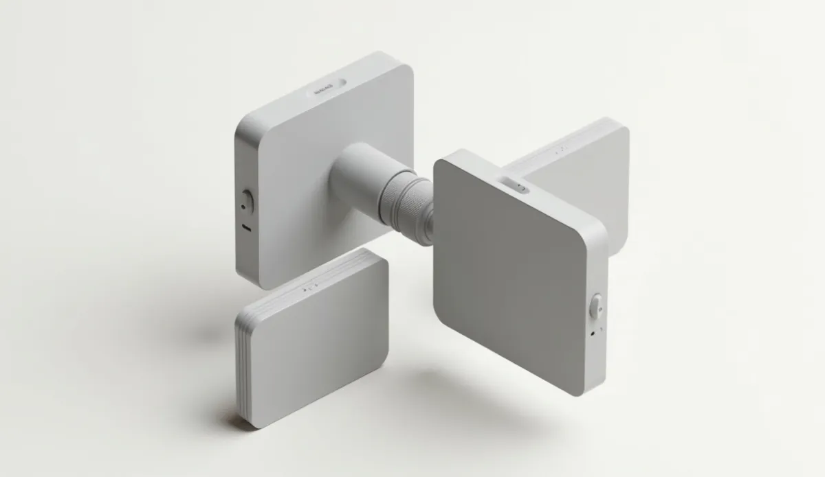
Native ad creatives that perform well share a specific visual grammar: real-looking subjects, home or lifestyle settings, off-center framing, and enough visual roughness that they don't read as a studio ad. Prompting an AI image model for native ads means writing for that grammar specifically. A generic "high quality advertisement photo" prompt produces an over-polished render that looks exactly like what it is, an ad, and gets skipped in a content feed where the ads that win look like they belong next to the articles.
Why generic AI image prompts fail on native placements#
Native ad units sit inside content feeds, next to real articles, competing for a fraction of a second of attention. Anything that looks "designed", symmetrical composition, studio lighting, a model with a catalog smile, reads as an interruption rather than content, and users have gotten very good at scrolling past that look. Compare that to the headlines that actually run for weeks: "A Window Cleaner Explained Why Sprays Make Your Glass Worse" or "My Garden Had No Butterflies for Years, Then I Hung One of These Up" both pair with images that look like a phone photo someone took in their own yard, not a rendered product shot. That candid quality is doing real work, and it's exactly what most default AI prompts fight against.
The prompt structure that works for native#
A native-ready prompt needs five components, and skipping any of them tends to push the output back toward "stock photo" territory:
- Subject and action - a specific person doing a specific, small thing, not a generic pose
- Setting - a real, slightly cluttered environment (kitchen counter, porch, garage), not a seamless backdrop
- Camera style - phone-camera framing, not a locked-off studio composition
- Lighting - natural, uneven light (window light, overcast daylight), not even studio lighting
- Imperfection cues - slightly off-center framing, mild motion blur, a candid rather than posed expression
Two example structures:
- "An elderly woman sitting on a porch step, candid phone-camera angle, natural afternoon light, slightly off-center framing, no posed smile, no text overlay"
- "Close-up of hands holding a small handheld device on a kitchen counter, warm indoor lighting, amateur photography style, visible counter clutter in the background"
Neither of these prompts asks for "quality" or "professional", both words that push most image models toward the polished look you're trying to avoid.
Matching prompts to angle and vertical#
| Vertical | Visual cues that tend to work |
|---|---|
| Health | Candid closeup, everyday setting, caution needed around before/after imagery due to compliance rules |
| Home & garden | Outdoor, yard or porch setting, natural light, visible everyday clutter |
| Finance | Paperwork, calculator, handwritten notes, kitchen-table setting rather than an office |
| Ecommerce | Product in actual use, lifestyle framing rather than a white-background product shot |
These four verticals also happen to carry the heaviest creative volume in the index: health, finance, insurance and ecommerce are the top four verticals overall in OpenAdLibrary's corpus of 725,000+ live native creatives (June 2026), which means the visual conventions that win in each are already heavily tested at scale rather than theoretical. Our state of native advertising 2026 data study breaks these vertical splits down further if you want the full picture before picking a creative direction.
Compliance and platform limits to prompt around#
Don't prompt for fake certification badges, "as seen on" logos, or a likeness that could be read as a specific real person, especially a celebrity, without rights to use it. This isn't just a policy risk with the ad network, it edges into the same territory covered in our guide to trademark infringement in ads. For health-adjacent verticals, avoid prompting for implied before/after transformation imagery, since that visual claim carries the same scrutiny as a written medical claim would.
Iterating on a prompt: what to change first#
When a generated image is close but not quite working, resist the urge to rewrite the whole prompt from scratch. Change one variable at a time, in this order: lighting first (natural light fixes more "looks fake" complaints than any other single change), then camera angle (a slight downward or off-axis angle reads more candid than a straight-on shot), then setting detail (adding one specific, slightly messy background element does more than any style keyword), and only then subject expression. Models tend to overcorrect when you change several variables in the same pass, so isolating the fix keeps you from trading one problem for another.
Aspect ratio and technical specs across networks#
Native placements aren't one-size-fits-all on image dimensions, and generating at the wrong ratio forces a crop that can cut off exactly the detail that made the image feel candid in the first place. Generate at the target aspect ratio from the start rather than generating square or landscape by default and cropping after the fact; a forced crop on a portrait-leaning image often pushes the subject dead-center, which immediately reads as more staged. If you're running the same creative across multiple networks, check each network's current spec rather than assuming Taboola, Outbrain and MGID all want the same crop, since placement sizes and safe zones differ and change over time.
A note on insurance and travel verticals#
Insurance and travel round out the verticals worth a specific mention. Insurance imagery tends to perform better with an everyday-life framing (a house, a car, a family setting) rather than anything that looks like a policy document or a call center, since the emotional hook is usually about security rather than paperwork. Travel creative, which shows up heavily on networks like Teads, tends to lean on aspirational-but-attainable framing, a real-looking destination shot rather than a glossy brochure image, which is a useful contrast case if you're used to prompting for health or finance verticals where the candid, unpolished style dominates even more heavily.
Testing AI-generated creative against what's already working#
Before generating a hundred variations, pull recent live creatives running in your vertical and use them as a style reference, not a template to copy outright. A native ad spy tool lets you filter by network and vertical to see what's actually running right now, which is a faster gut-check on visual style than guessing from first principles. Our guides on native ad creative best practices and analyzing winning native ad creatives go deeper on reading hooks and angles once you've got the visual style dialed in, and hook vs angle vs claim is worth reading before you write the prompt at all, since the image needs to support the specific hook you're testing, not just look generically native.
Building a small prompt library instead of starting from scratch every time#
Once you've found a prompt structure that consistently produces usable output for a given vertical, save it as a template with placeholders for subject, setting and angle-specific detail, rather than rewriting the whole prompt from memory each time. Treating prompts as reusable assets, the same way you'd treat a proven headline formula, cuts down on the trial-and-error cost of getting back to a working style every time you start a new batch. It also makes it easier to spot when a network's model updates shift the output style, since you're comparing against a known baseline prompt rather than guessing whether the change is the model or your wording.
Common mistakes#
- Over-designed, studio-lit images that read as "ad" the instant they load
- Ignoring aspect ratio and crop requirements per network and placement, which forces a bad last-minute crop
- Reusing one generated image across too many headline variants, which accelerates creative fatigue faster than you'd expect
- Prompting for exaggerated or shock-value imagery that trips network creative policy before it ever gets an impression
- Changing several prompt variables at once when troubleshooting, which makes it hard to tell what actually fixed or broke the output
Bottom line#
Write prompts for the specific visual grammar of the placement, not for generic "ad quality." Subject, setting, camera style, lighting and a deliberate touch of imperfection will get you closer to what already wins in a native feed than any amount of prompting for polish ever will.