
 Español
 Português (Brasil)
 Français
 Deutsch
 Italiano
 Nederlands
 Polski
 Svenska
 Türkçe
 Русский
 日本語
日本語 한국어
한국어 简体中文
简体中文 Tiếng Việt
 Bahasa Indonesia
 繁體中文
繁體中文 Čeština
 Dansk
Dansk Norsk (bokmål)
 Suomi
Suomi Ελληνικά
 Română
 Magyar
 Українська
 ไทย
ไทย हिन्दी
 العربية
 עברית
עברית7 Advertorial Templates That Still Convert (With Full Structure)
The seven advertorial skeletons that keep converting on native traffic — each with its full section structure, when to use it, where it fails, and the disclosure rules that keep it legal.


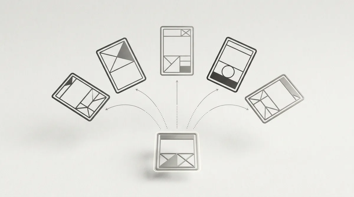
An advertorial template is a repeatable section structure — headline, hook, problem, mechanism, proof, offer bridge, call to action — that turns ad copy into something that reads like an article. Templates work because advertorials succeed or fail on structure, not on wording: the same seven skeletons keep converting across health, finance, ecommerce and lead-gen because each one manages the reader's skepticism in a different, predictable way. Below are the seven, with the section-by-section structure for each, when to use it, and where it goes wrong.
Before the template: what an advertorial has to do#
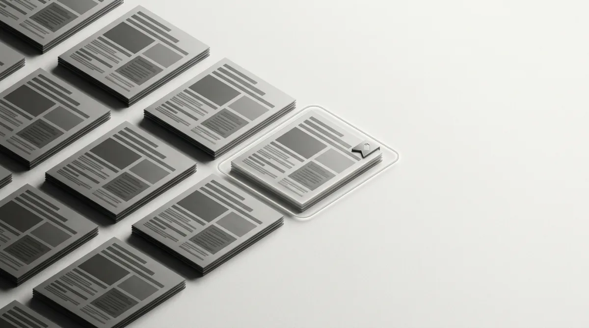
An advertorial usually sits in the middle of a native funnel: the ad wins the click, the advertorial pre-sells, the offer page closes. It is a pre-lander with editorial form — the reader arrives cold from a feed, and the page's job is to convert curiosity into belief before any price appears. The full mechanics of that three-step flow are covered in our guide to landing page funnels for native traffic.
Whatever template you pick, three requirements are non-negotiable:
- Disclosure. If it looks editorial and money changed hands, it must be labeled as advertising — clearly, near the top, not in gray 8-point text in the footer. The FTC's native advertising guidance treats deceptive formatting as illegal even when every claim is true; our FTC disclosure rules breakdown translates it for practitioners.
- One idea. An advertorial advances a single mechanism or story. The moment it starts multi-tasking, it reads like a brochure and dies.
- A promise it inherits. The advertorial must pay off whatever the ad's headline teased. A mismatch between ad angle and opening paragraph is the most common funnel leak we see.
Template 1: The first-person discovery story#
The workhorse of health, beauty and gadget offers. A relatable narrator has the reader's problem, exhausts the normal solutions, stumbles onto the mechanism, and documents the result.
Structure:
- Headline restating the ad's tease in story form
- The low point — narrator's problem, specific and sensory
- Failed solutions montage (the reader's own attempts, validated)
- The discovery moment — a friend, a specialist, an article
- The mechanism in plain words — why this works when the rest didn't
- Results with concrete texture (timeline, small setbacks included)
- Offer bridge: where to get it, framed as helpfulness
- CTA with a soft urgency element
When to use: problem-aware audiences, products with a visible before/after, offers that need empathy more than evidence. Where it fails: fabricated-feeling perfection. Stories without a setback or a specific detail read as fiction — and invented testimonials or fake personas cross the compliance line, not just the taste line.
Template 2: The expert explainer#
Authority does the selling: a named or credentialed figure explains why the conventional approach fails and what the mechanism does differently. This is the advertorial behind most "Cardiologist says…" native ads.
Structure:
- Credential-forward opening — who this is and why they'd know
- The contrarian claim: the standard solution addresses the wrong cause
- The real cause, explained simply (one diagram-worthy idea)
- The mechanism that addresses the real cause
- Evidence layer — studies, professional experience, patient patterns
- What to look for in a solution (criteria that happen to match the product)
- Offer bridge and CTA
When to use: skeptical audiences, science-adjacent products, higher price points. Where it fails: borrowed authority you can't back. Implied medical endorsements attract network policy teams and regulators faster than any other format — keep the expert real, the claims substantiated, and the disclosure prominent.
Template 3: The listicle advertorial#
"7 Reasons…", "5 Signs…", "9 Mistakes…" — the list format lowers reading resistance because the reader can skim to the items that hit.
Structure:
- Numbered headline with a specific, odd count
- One-paragraph frame: who this list is for
- Items 1 through N-1: genuinely useful, escalating relevance
- Final item (or items) introducing the product as the natural answer
- Offer bridge and CTA
When to use: colder traffic, broad audiences, offers that benefit from education. The buried-pitch structure feels less like an ad. Where it fails: padding. If items 1–4 are filler, the reader leaves before the pitch; every item must earn its place.
Template 4: The comparison roundup#
"We tested 5 [category] — here's what actually worked." The advertorial performs the research the reader was about to do, and your product wins on criteria that favor it honestly.
Structure:
- Headline promising a verdict, not a review
- Methodology paragraph — what was compared and how (this is the credibility engine)
- Ranked entries with real trade-offs; competitors get genuine strengths
- Winner's entry: longer, specific, criteria-anchored
- Verdict recap table
- Offer bridge with a reason to act (stock, discount honesty required)
When to use: solution-aware shoppers already comparing options — the strongest template for ecommerce and software. Where it fails: rigged-feeling rankings and fake testing claims. If you didn't test, don't say you did; frame it as a criteria-based comparison instead.
Template 5: The news-style trend report#
Reads like service journalism: "Why thousands of retirees are switching to X." The product is covered as a phenomenon, not pitched.
Structure:
- Trend headline anchored to a demographic
- Lede: the shift, sized honestly
- Why now — the enabling change (price, technology, regulation)
- Voices: users or observers of the trend
- How it works, briefly
- How to evaluate joining the trend
- Offer bridge and CTA
When to use: offers with real momentum, demographic-targeted campaigns, finance and insurance funnels. Where it fails: fake-news cosplay. Invented publications, fabricated statistics and counterfeit outlet branding are the scam end of this template — the same structure works with honest sourcing, and the dishonest version gets accounts banned and brands cloned (we document that pattern constantly in brand-protection work).
Template 6: The Q&A / interview#
The skeptic's template: a question-and-answer format that lets you voice and defuse objections in the reader's own words.
Structure:
- Headline framing the central question
- Short setup: who's being asked, why it matters
- Questions ordered as escalating objections — "Does this actually work?", "What's the catch?", "Why haven't I heard of this?"
- Honest-cost answer (price, limitations) to buy credibility
- Closing question that naturally sets up the offer
- CTA
When to use: offers that trigger a specific, predictable objection; re-engaging audiences who clicked but didn't convert. Where it fails: softball questions. If every answer is a victory lap, the format's skepticism-absorbing power evaporates.
Template 7: The warning piece#
Loss-framed: "What no one tells you about X" / "Avoid these 5 mistakes before buying Y." The advertorial positions itself as consumer protection and earns trust by attacking the category's real problems — which your product happens to solve.
Structure:
- Warning headline naming the purchase moment
- Stakes paragraph: cost of getting it wrong
- The mistakes/traps, each concrete and checkable
- The checklist a smart buyer should apply
- The recommendation that passes the checklist
- Offer bridge and CTA
When to use: high-consideration purchases, saturated categories where trust is exhausted. Where it fails: manufactured fear. The warnings must be real, verifiable category problems, or the piece reads as concern-trolling.
The anatomy all seven share#
| Section | Job | Heuristic |
|---|---|---|
| Headline | Re-earn the click's promise | Mirrors the ad angle, tightens it |
| Hook (first 2–3 paragraphs) | Make leaving feel costly | Problem or tension, no product yet |
| Mechanism | Convert curiosity to belief | One idea, explainable in a sentence |
| Proof | Absorb skepticism | Specifics beat superlatives |
| Offer bridge | Move from editorial to transaction | Framed as the logical next step |
| CTA | Convert | Repeated 2–3 times, identical destination |
On length and pacing: most winning native advertorials land between roughly 800 and 1,500 words. Shorter, and there isn't room to build a mechanism and absorb skepticism; longer, and cold feed traffic — which arrived on a curiosity click, not a research mission — leaks out the sides. Paragraphs stay short, subheads carry skimmers from hook to bridge, and images earn their place by advancing the story (a before/after, a mechanism diagram, the narrator) rather than decorating it. Write for the reader who skims first and decides whether to actually read second; the subheads alone should sell the piece's argument end to end.
The headline deserves disproportionate effort — it inherits the native ad's promise, and the pairing between ad hook and advertorial opening is where funnels leak. Our headline swipe-file data and the hook vs angle vs claim breakdown cover that pairing in depth.
Writing the offer bridge: the transition that decides everything#
Every template above funnels into the same hard moment: the sentence where editorial becomes offer. Handle it badly and the reader feels the switch — the piece retroactively becomes an ad, and the trust the first 800 words earned evaporates.
Three constructions consistently survive the transition:
- The criteria bridge. The piece has established what a good solution must do; the offer is introduced as the thing that meets the criteria. ("After looking at what actually mattered — X, Y, Z — one option kept coming up.")
- The narrator's source. In story templates, the reader wants what the narrator got; naming where the narrator got it is a favor, not a pitch.
- The availability note. In news and expert templates, a short practical paragraph — where it's available, what it costs, what to check — reads as service journalism rather than selling.
What kills bridges: exclamation points, sudden second-person commands ("Don't wait!"), and discount urgency appearing in a piece that spent five sections being calm. The bridge should match the register of everything above it.
Testing advertorials: what to change first#
Advertorials are funnels, so test them like funnels — one variable at a time, in order of leverage:
- Ad-to-advertorial pairing first. The same advertorial can double or halve in performance depending on which ad angle feeds it. Test pairings before touching the page.
- Headline and first screen second. Most losses happen before the second paragraph; scroll depth tells you whether the hook holds.
- Bridge placement third. Moving the first product mention earlier or later shifts the balance between advertorial CTR and offer-page conversion — watch both, because a "better" advertorial click-through that collapses downstream conversion is a worse funnel.
- Proof density last. Adding or trimming evidence sections is refinement, not rescue. If a template is losing badly, change templates rather than polishing sections.
Read results at the funnel level: cost per conversion end-to-end, not page-level CTR. An advertorial's job is to send fewer, better-prepared visitors to the offer.
Common advertorial mistakes#
- Burying the disclosure — a compliance problem that also, counterintuitively, hurts conversion; readers who feel tricked bounce harder at the offer.
- Opening with the product. If the first paragraph names the product, you've written a long ad, not an advertorial.
- Stacking mechanisms. Two miracle explanations halve each other's credibility.
- Perfection in testimonials. Flawless outcomes with no timeline or setback read as fabricated — because they usually are.
- Blog-post furniture. Navigation menus, sidebars, related-post widgets and outbound links are exits; a paid page should have exactly one way forward.
Matching template to offer and traffic#
- Nutra and beauty: discovery story or expert explainer — empathy and mechanism carry implied-claim-heavy verticals; mind the compliance realities of nutra on native.
- Finance, insurance, home services lead-gen: news trend report or warning piece — demographic framing matches how these audiences are targeted.
- Ecommerce and software: comparison roundup for solution-aware traffic; listicle for colder audiences.
- High-ticket or unfamiliar products: Q&A to defuse objections, or expert explainer to build the mechanism.
- Colder traffic → more editorial (listicle, trend report); warmer traffic → more direct (comparison, Q&A). The most common native ad angles study shows which ad-side angles pair with which pre-lander styles in the wild.
Study live advertorials before you write one#
Templates compress experience, but nothing replaces reading the advertorials that are winning in your vertical right now. OpenAdLibrary traces the click path behind live native ads — 1.3 million landing captures tied to 725,000+ live creatives across 49 networks as of June 2026 — so you can go from a long-running ad to the exact advertorial behind it in a few clicks with the native ad spy tool. Filter your vertical for ads running 30+ days, open their landing captures, and template-match what you find: how they disclose, how long the hook runs, where the first product mention lands. Our walkthrough on reverse-engineering a competitor's native funnel turns this into a step-by-step process, and the advertorial landing page examples teardown annotates real pages section by section.
Check across geos while you're there: the same offer often runs a story template in one market and a news template in another, because advertorial conventions — and enforcement — differ by country. What the biggest spender in your vertical does in your target geo is worth more than what any template article, including this one, tells you.
A template that has been running on someone else's budget for six weeks is the cheapest market research you will ever get — swipe the skeleton, write your own truth into it, disclose clearly, and test the headline pairing before anything else.