
 Español
 Português (Brasil)
 Français
 Deutsch
 Italiano
 Nederlands
 Polski
 Svenska
 Türkçe
 Русский
 日本語
日本語 한국어
한국어 简体中文
简体中文 Tiếng Việt
 Bahasa Indonesia
 繁體中文
繁體中文 Čeština
 Dansk
Dansk Norsk (bokmål)
 Suomi
Suomi Ελληνικά
 Română
 Magyar
 Українська
 ไทย
ไทย हिन्दी
 العربية
 עברית
עבריתMobile Landing Pages for Native Ads: Design Rules That Convert
Native traffic is a phone-first audience, so a pre-lander adapted down from desktop will underperform one built mobile-first. Here are the design rules that actually move conversion.


Native ad traffic is overwhelmingly mobile, since it originates in content feeds people scroll on their phones, so a pre-lander built desktop-first and adapted down will underperform one designed mobile-first from the start. The design rules that matter most are page weight, thumb-reachable CTA placement, single-column layout, and avoiding anything a network's compliance review treats as an interstitial or forced interaction.
Why the desktop-first-then-adapt approach fails so often#
Teams that design a pre-lander on a desktop monitor first tend to bake in assumptions that don't survive the shrink down to a phone: multi-column layouts that get squeezed into an unreadable single column at the last minute, hero images cropped for a wide aspect ratio that lose their focal point when cropped again for a narrow one, and CTA placement decided by what looked balanced on a large screen rather than what a thumb can actually reach. None of these show up as a "bug" you'd catch in a quick desktop review, they only show up once you view the page the way your actual visitor will, which is why building mobile-first from the first draft, then optionally adapting up to desktop, produces fewer surprises than the reverse.
Design for the thumb, not the mouse#
Every element that requires precision tapping costs conversions on a phone. CTA buttons need to be large enough to hit reliably, positioned where a thumb naturally rests (lower-middle to lower-third of the screen works better than a button that requires stretching to the top), and spaced away from other tappable elements so a mis-tap doesn't send someone somewhere you didn't intend. A sticky CTA bar that stays visible as the reader scrolls through a longer advertorial removes the need to scroll back up once they're convinced, which matters more the longer your page runs and the more your format leans toward a full narrative rather than a short bridge page.
Page weight is a conversion lever, not just a technical concern#
Every extra second of load time on a mobile connection is a chance to lose someone who clicked on impulse from a content feed and has zero patience for a slow page. Compress hero images aggressively, avoid autoplaying video (which also tends to draw compliance scrutiny on several networks and burns mobile data the reader didn't agree to spend), lazy-load anything below the fold, and keep the DOM simple. This compounds with domain and hosting choices; a page hosted behind a slow, oversubscribed shared server, or one that routes through an unnecessary extra redirect hop, undoes good design work before a single pixel renders. Good hosting is a prerequisite for good mobile design, not a separate concern you can fix later.
Layout: single column, vertical flow, no sideways surprises#
Multi-column layouts that work on desktop typically collapse badly on mobile unless they were designed mobile-first. Stick to a single vertical column: hero image or headline block, supporting copy in short paragraphs, a clear visual break before the CTA, then either the offer transition or the next content block. Avoid horizontal scroll entirely, it's disorienting on a phone and rarely intentional when it happens.
What to avoid because networks will flag it#
- Forced interstitials or pop-ups that block content before a genuine user action. Most native networks' editorial policies treat these as poor user experience and a common source of creative rejections; check the specific network's current documentation before relying on any interstitial pattern.
- Autoplay audio or video. Same reasoning: it surprises the reader, burns their data, and draws review attention.
- Fake system UI elements (fake "battery low" warnings, fake notification banners, fake close buttons that don't close anything). These sit close to cloaking territory in how compliance teams read them, even when no technical cloaking is happening, because they deceive the reader about what they're looking at.
- Disclosure buried or hidden behind a tap. Sponsorship and advertising disclosures need to be visible without extra interaction on the reader's part; see FTC Disclosure Rules for Advertorials & Native Ads for what "visible" actually means under current guidance.
Typography and reading rhythm on a small screen#
Body text that's comfortable on a desktop monitor is often too small on a phone unless you set it deliberately for mobile: a base font size large enough to read without pinch-zooming, generous line height, and paragraphs kept short, three to four lines at most before a break. Long unbroken paragraphs are one of the fastest ways to lose a mobile reader mid-page, since there's no visual resting point to signal progress. Break up longer advertorial copy with subheadings, pull quotes, or a relevant image every few paragraphs, both to aid pacing and to give the reader a reason to keep scrolling rather than bouncing at the first wall of text.
Touch targets beyond just the CTA#
The primary CTA gets the design attention, but secondary tappable elements (a "learn more" link, a close button on any dismissible element, navigation if the page has any) need the same thumb-friendly sizing and spacing. A close button that's technically present but too small to hit reliably functions, in practice, as no close button at all, and reads as frustrating or manipulative to a reader trying to dismiss something. Apple and Google's own mobile design guidelines both specify minimum touch target sizes for exactly this reason, and following them is a reasonable baseline even outside native platform apps.
Forms: fewer fields, native input types#
If the pre-lander or the offer step behind it collects any information, every additional field is a drop-off point on mobile, where typing is slower and more error-prone than on desktop. Use the right input type for each field (numeric keypad for phone numbers, email keyboard for email fields) so the phone's own keyboard helps the visitor instead of forcing them to hunt for characters on a general keyboard. If you can defer a field to a later step in the funnel instead of asking for it on the pre-lander itself, do that.
Geo and language details that trip up mobile pages specifically#
Currency symbols, date formats, and phone number formats vary by geo, and getting them wrong reads as untrustworthy faster on a small screen than on a large one, where a visitor has less patience to parse an unfamiliar format while also trying to read the offer. If you're running the same pre-lander template across multiple geo tiers, localize these details properly rather than defaulting to one geo's conventions everywhere.
Handling network-injected UI on top of your page#
Several native networks render their own elements around or on top of your content, a sponsored label, a close or back control, sometimes a native-styled comment or engagement widget the network itself controls. Design your page assuming that overlay exists rather than testing only in a clean preview environment, since a CTA or headline positioned right where a network's own UI element renders on a real device is effectively invisible to the reader. Check how your page actually looks inside the network's real in-feed rendering, not just as a standalone URL, before finalizing layout decisions that depend on precise vertical positioning near the top of the page.
Checking what's already working on mobile-heavy networks#
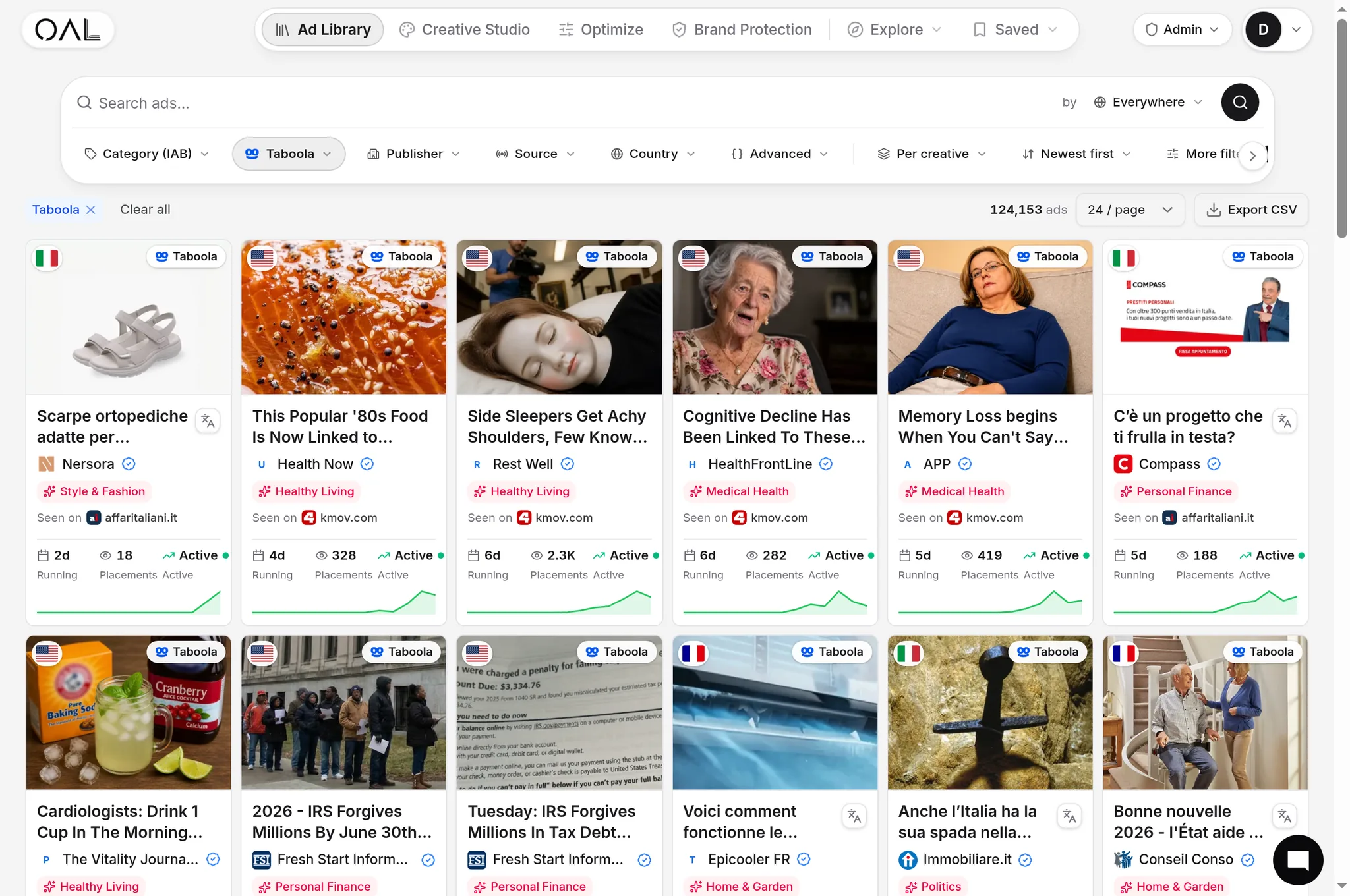
Some networks skew more mobile than others in practice, and the winning pre-lander patterns differ accordingly. Reviewing live, currently-running creatives and their traced landers on OpenAdLibrary's native ad spy tool shows you what format and layout choices are actually surviving on a given network right now, rather than applying generic mobile UX advice that doesn't account for how a specific network's audience behaves. MSN Native Ads: The Advertiser's Guide and How Taboola Ads Work both cover network-specific placement and audience behavior that feeds into these layout decisions.
Accessibility overlaps with conversion more than people expect#
Sufficient color contrast between text and background, readable font sizes without requiring zoom, and CTA buttons that are distinguishable by more than color alone all help visitors with impaired vision, but they also help every visitor reading a phone screen outdoors in bright sunlight or on an older, dimmer display. Treat basic accessibility practice as a conversion input, not a separate compliance checkbox, since the population it helps is much larger than the population it's officially aimed at.
The test that actually matters#
Before shipping any mobile pre-lander design, load it on an actual phone over a throttled connection, not just in a desktop browser's mobile emulator. Emulators get the viewport right but rarely reproduce real load times, tap-target accuracy, or how a sticky element behaves under real scroll momentum. Five minutes on a real device catches problems that weeks of desktop-based iteration will miss entirely.