
 English
 Español
 Português (Brasil)
 Français
 Deutsch
 Italiano
 Polski
 Svenska
 Türkçe
 Русский
 日本語
日本語 한국어
한국어 简体中文
简体中文 Tiếng Việt
 Bahasa Indonesia
 繁體中文
繁體中文 Čeština
 Dansk
Dansk Norsk (bokmål)
 Suomi
Suomi Ελληνικά
 Română
 Magyar
 Українська
 ไทย
ไทย हिन्दी
 العربية
 עברית
עבריתNative Ad Afbeeldingsformaten: De Cheat Sheet voor Elk Groot Netwerk
Eén masterafbeelding, vier crops, elk groot native netwerk gedekt. De werkende standaardformaten voor Taboola, Outbrain, MGID, Revcontent, MediaGo, MSN en Yahoo — plus de crop-overlevingsregels die belangrijker zijn dan pixels.

Er is geen enkel native ad afbeeldingsformaat — elk netwerk cropt je afbeelding om te passen in welke widget elke uitgever ook draait. Het praktische antwoord: bouw één masterafbeelding van 1200 px breed of groter met het onderwerp gecentreerd in de middelste 60–70% van het frame, exporteer dan vier crops die vrijwel elk groot netwerk dekken — 16:9 voor Taboola, 3:2 voor Outbrain en MGID, 1.91:1 voor MSN, MediaGo en Yahoo, en 1:1 voor vierkante feed-plekken. Ontwerp voor aspectratio en crop-overleving, niet voor exacte pixels, en je voldoet aan de specificaties van elk netwerk dat ertoe doet.
De cheat sheet#
De onderstaande tabel toont de ratio's om voor te ontwerpen en de algemeen gedocumenteerde aanbevolen uploadformaten vanaf medio 2026. Netwerken herzien specificaties zonder aankondiging, dus beschouw dit als je werkende standaard en verifieer tegen de huidige creatieve documentatie van het netwerk voor een grote lancering — Taboola's helpcenter, Outbrain's advertiser resources en Microsoft Advertising's docs zijn de primaire bronnen voor de grote drie.
| Netwerk | Ontwerp ratio | Algemeen gedocumenteerde upload | Notities |
|---|---|---|---|
| Taboola | 16:9 | 1200×674 aanbevolen | Brede crop; GIF/korte-video "motion ads" draaien op veel plaatsingen |
| Outbrain (Teads) | 3:2 | 1200×800 aanbevolen, ~400×260 minimum | Iets hoger dan Taboola — een 16:9 master verliest hier randen |
| MGID | ~3:2 | Upload ≥600 px breed; crop in dashboard | De teaser cropper is waar je framing overleeft of sterft |
| Revcontent | 4:3 tot 1:1 per widget | Upload ≥1000 px breed | Widget-stijlen variëren sterk per uitgever; check huidige docs |
| MediaGo | ~1.91:1 | Upload ≥1200 px breed | MSN-gerelateerde inventory; landscape-first |
| Microsoft Audience Network | 1.91:1 en 1:1 | 1200×628 en 1200×1200 | Lever beide ratio's — feeds kiezen per plaatsing |
| Yahoo DSP (native) | 1.91:1 en 1:1 | 1200×627 en 627×627 (+180×180 icoon) | Lang bestaande specificatie overgenomen van Yahoo Gemini |
| Teads (branded formats) | Varieert per format | Landscape + vierkante masters | Format-specifiek; check de huidige specificatiesheet |
Twee dingen die deze tabel je niet kan vertellen: hoe je afbeelding de crop van elk netwerk overleeft, en hoe klein hij wordt gerenderd in het wild. Die twee factoren doden meer native creatives dan welke specificatie-overtreding ook.
Aspectratio verslaat pixels#
Native netwerken serveren één creative in duizenden uitgeverstemplates. Je afbeelding wordt gerenderd als een grote card op de ene site, een thumbnail van 100 pixels breed in een sidebar content recommendation widget op een andere, en een mid-article in-feed unit op een derde. Het creative spec van het netwerk definieert wat je uploadt; de template van de uitgever definieert wat mensen daadwerkelijk zien.
Dat heeft drie praktische consequenties:
- Centreer alles. Crops eten eerst randen. Als je product, gezicht of focusobject in de middelste 60–70% van het frame zit, houdt elke ratio van 16:9 tot 1:1 het intact.
- Ontwerp voor de thumbnail, verifieer op volledige grootte — niet andersom. Een afbeelding die leesbaar is op 120 px breed (één onderwerp, strakke crop, sterk contrast) werkt ook op 1200 px. Het omgekeerde is zelden waar.
- Upload groot. Netwerken schalen moeiteloos omlaag maar slecht omhoog. Een upload van 600 px die wordt uitgerekt op een grote card-plaatsing ziet er zacht uit, en zachte afbeeldingen lezen als weinig vertrouwen. Start indien mogelijk vanaf bronbestanden van minimaal 1600 px breed.
De one-master-image workflow#
Per-netwerk creatives vanaf scratch produceren is hoe teams eindigen met twaalf inconsistente varianten. Doe het één keer, goed:
- Selecteer of fotografeer op 1600 px+ breed, onderwerp gecentreerd, achtergrond eenvoudig. Drukte achtergronden sterven op thumbnailgrootte.
- Pas de veilige zone toe. Stel je een rechthoek voor die de centrale 60–70% van het frame beslaat — alles betekenisvols bevindt zich erbinnen. Niets belangrijks binnen ongeveer 10–15% van welke rand dan ook.
- Exporteer de vier werkende crops: 16:9 (1200×674), 3:2 (1200×800), 1.91:1 (1200×628) en 1:1 (1200×1200). Die set voldoet aan de ontwerpverhoudingen van elk netwerk in de cheat sheet.
- Preview op thumbnailgrootte. Verklein elke crop tot ~120 px breed. Als je niet in een halve seconde kunt zien wat het is, kan een feed-scroller dat ook niet.
- Check de crop in de preview-tool van elk netwerk voor lancering — vooral MGID's teaser cropper en MSN's dual-ratio feed preview, waar auto-cropping verrassingen het meest voorkomen.
Netwerk-voor-netwerk notities#
Taboola: ontwerp breed, verwacht klein#
Taboola's 16:9 aanbeveling is de breedste werkende ratio in native, en zijn uitgeversbasis rendert alles van hero-sized cards tot dichte multi-thumbnail grids. De compositie die beide extremen overleeft is een enkel onderwerp dat 50–70% van het frame vult. Motion ads (GIF/korte video) zijn een echte differentiator op Taboola-plaatsingen — subtiele beweging trekt aandacht in een statische feed — maar houd beweging langzaam en loop-vriendelijk; flitsen of stroboscopisch wordt afgekeurd. Bestudeer hoe de mechanica van het netwerk creatives vormgeeft in hoe Taboola ads werken.
Outbrain: de 3:2 discipline#
Outbrain's 3:2 ratio is hoger dan Taboola's 16:9, en dat verschil is precies waar one-master-fits-all workflows breken: een 16:9 afbeelding die gecentreerd wordt gecropt naar 3:2 verliest zijn linker- en rechterranden. Als je beide netwerken draait — wat de meeste serieuze native buyers doen — exporteer dan beide crops vanuit dezelfde master in plaats van een van de netwerken de file van het andere te laten auto-croppen.
MGID en Revcontent: respecteer de cropper#
Op de mid-tier netwerken is de dashboard-cropping stap waar creatives stilletjes sterven. Upload de grootste bron die je hebt, stel dan handmatig de crop in op elke teaser in plaats van de default te accepteren — auto-crops onthoofden routinematig onderwerpen of snijden producten doormidden. Widget-stijlen variëren hier meer per uitgever dan bij de majors, dus leesbaarheid op thumbnailgrootte is nog belangrijker.
Microsoft Audience Network: feed beide ratio's#
MSN-plaatsingen putten uit zowel de 1.91:1 landscape als de 1:1 vierkante asset. Adverteerders die alleen de landscape-afbeelding uploaden laten het netwerk het vierkant synthetiseren — en een geautomatiseerde center-crop van een landscape-compositie is zelden het vierkant dat je zelf zou hebben gekozen. Bouw het 1:1 bewust vanuit de master. De MSN native ads guide behandelt de andere eigenaardigheden van het netwerk.
Yahoo en Teads: check voor je bouwt#
Yahoo's native specificatie (1200×627 plus 627×627 en een 180×180 icoon) heeft meerdere platformherstructureringen sinds het Gemini-tijdperk overleefd, maar beide platforms hebben format-specifieke variaties — bevestig de huidige sheet voor het exacte plaatsingstype voordat je finals produceert.
Desktop vs mobiel: waar je afbeelding daadwerkelijk rendert#
De meeste native inventory wordt geconsumeerd op mobiel, en mobiel is waar afbeeldingen het kleinst renderen — vaak 100–140 px breed in gestapelde feed-units onder artikelen. Desktop-plaatsingen (sidebar grids, end-of-article rows) renderen groter maar verdienen minder aandacht per impressie. De asymmetrie bepaalt je ontwerpprioriteit: als een creative alleen werkt op desktop card-grootte, faalt hij op de meerderheid van de impressies die hij daadwerkelijk ontvangt. Dit is ook waarom device-split testing ertoe doet — dezelfde afbeelding kan winnen op desktop en verliezen op mobiel puur omdat fijn detail verdwijnt op thumbnail-schaal.
Tekst, logo's en overlays: houd ze uit de afbeelding#
Native netwerken zijn beschermend over de editoriale look van hun feeds, en de meeste beperken of keuren afbeeldingen af met zware overlaytekst, toegevoegde randen, nep-play-knoppen, of interface-elementen die de omliggende pagina imiteren. Beleid verschilt in formulering maar convergeert in praktijk:
- Minimaal of geen tekst in de afbeelding. Het headline-veld is waar je woorden horen; een afbeelding vol bijschrifttekst wordt op sommige netwerken afgekeurd en op de rest gecropt tot onzin.
- Geen misleidende UI. Nep-close-knoppen, nep-video-controls en screenshot-stijl chrome zijn breed verboden.
- Logo's: klein, binnen de veilige zone, of afwezig. Een logo in een hoek is het eerste dat een crop verwijdert.
Dit is een echt verschil met social advertising, waar tekst-op-afbeelding een hele creatieve taal heeft gebouwd. Creatives rechtstreeks overgezet vanuit Meta-campagnes zijn de meest voorkomende specificatie-overtreding die we zien — vierkante, tekstzware afbeeldingen die zowel de ratio als de overlay-conventies van feed-plaatsingen schenden. Als je budget verplaatst, behandelt onze gids voor native ad creative best practices de volledige vertaling, niet alleen de sizing.
Formatten, bestandsgrootte en beweging#
- JPEG en PNG worden overal geaccepteerd. Gebruik JPEG voor fotografie (kleinere bestanden), PNG alleen waar je het echt nodig hebt.
- Houd bestanden licht. Netwerken re-comprimeren op hun CDN's, maar een magere upload — een paar honderd kilobytes in plaats van meerdere megabytes — voorkomt kwaliteit-vernietigende dubbele compressie en helpt in slow-network geos.
- Geanimeerde formaten zijn netwerk-specifiek. Taboola draait GIF/korte-video motion ads op veel plaatsingen; verschillende andere netwerken accepteren alleen statische afbeeldingen. Ga nooit uit van animatie-ondersteuning — check de huidige specificatie, en upload altijd een statische fallback.
- Upload het formaat dat het dashboard vraagt, niet het formaat dat de feed serveert. Netwerken willen typisch JPEG of PNG bij upload en transcoderen dan naar moderne formaten zoals WebP op hun eigen CDN's. Je creative converteren naar WebP of andere next-gen formaten voor upload levert niets op en wordt afgekeurd door sommige upload-validators — houd je masters als hoogwaardige JPEG/PNG en laat het netwerk de leveringsoptimalisatie afhandelen.
Nog een format-notitie vanuit de capture-kant: omdat netwerken agressief re-encoderen voor levering, is de versie van je ad die een gebruiker daadwerkelijk ziet vaak zichtbaar zachter dan je upload. Dat is nog een reden om te starten vanaf een oversized, scherpe master — compressie-artefacten stapelen op, en een bestand dat marginaal was bij upload is pap tegen de tijd dat het rendert in een feed widget op een mid-range telefoon.
Wat echte adverteerders daadwerkelijk uploaden#
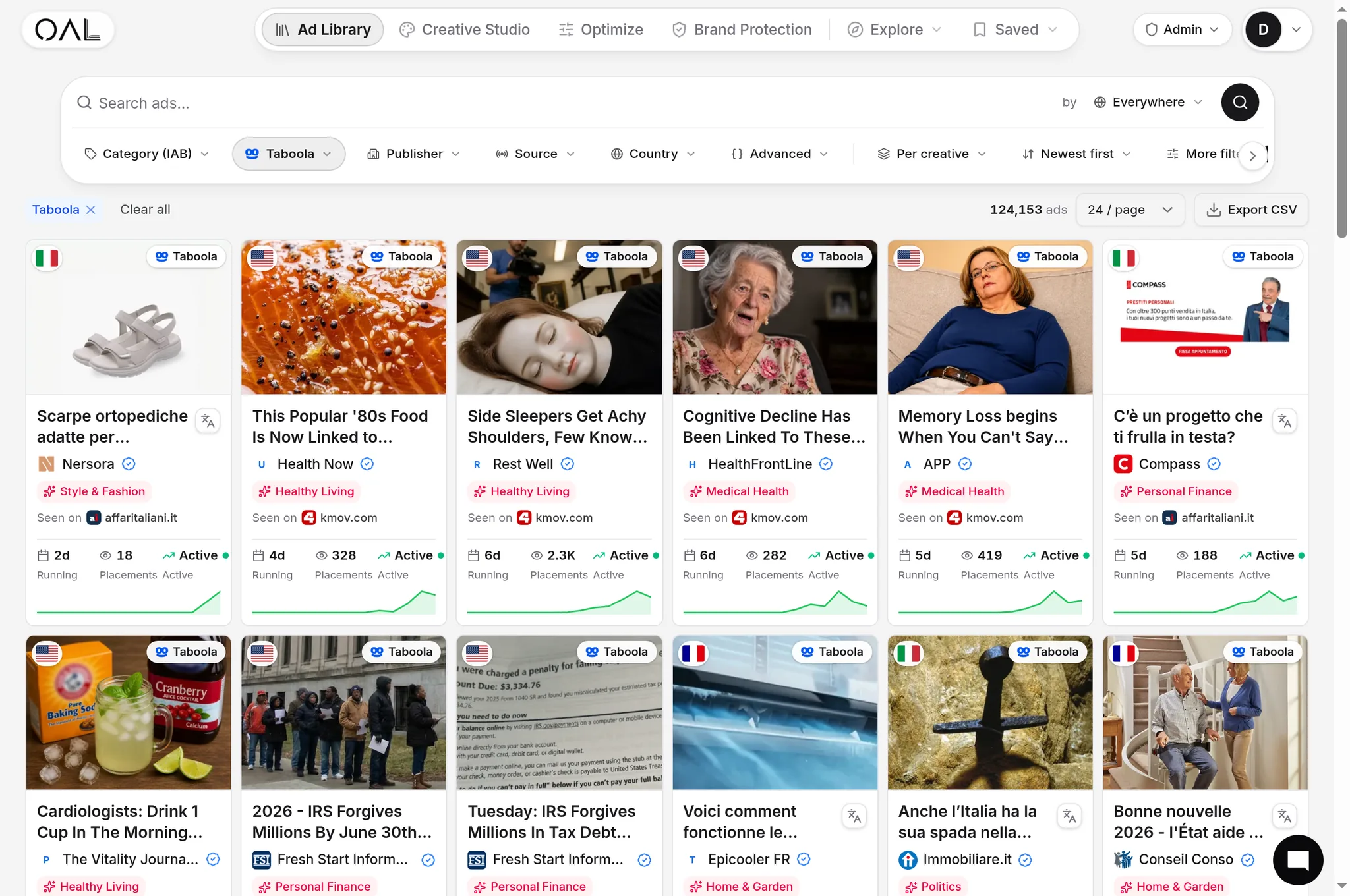
Specificaties vertellen je wat is toegestaan; het live corpus vertelt je wat wint. OpenAdLibrary slaat de full-quality creative op voor 725.000+ live native ads over 49 netwerken (juni 2026) — de daadwerkelijke bestanden geserveerd in feeds, niet screenshot crops — zodat je precies kunt inspecteren hoe langlopende adverteerders binnen deze dimensies componeren. Blader door je vertical in de native ad spy tool en een paar patronen vallen moeilijk te missen:
- Langlopende health en beauty creatives zijn overweldigend single-subject close crops — één gezicht, één product, één lichaamsdeel — omdat die elke ratio overleven en leesbaar blijven op 100 px.
- Winnende ecommerce-afbeeldingen tonen het product in gebruik onder een hoek, niet een witte-achtergrond catalogusfoto.
- De ads die 30+ dagen blijven draaien bevatten bijna nooit overlaytekst. Longevity is hier de kwaliteitsfilter: een ad die blijft draaien is een ad die blijft renderen, zoals behandeld in onze ad longevity analysis, en live Taboola ad examples op volledige kwaliteit bestuderen verslaat reverse-engineeren van gecomprimeerde thumbnails.
Wanneer een creative van een concurrent een maand heeft gedraaid, zijn zijn compositie-keuzes — crop-strakheid, onderwerpplaatsing, achtergrondbehandeling — gevalideerd op precies de formaten in de cheat sheet hierboven. Steel de compositie-logica, niet de afbeelding.
De corpusdistributie is ook een nuttige sanity check op waar sizing-inspanning loont: het Microsoft Audience Network is het grootste single-network corpus in de index met 281.839 live creatives, met Taboola op 206.145 en Outbrain op 108.573 (juni 2026). Als die drie je budget dragen, dekken het 1.91:1 + 1:1 paar en het 16:9/3:2 paar samen de overweldigende meerderheid van impressies die je ooit zult kopen — wat precies is waarom de four-crop master workflow bestaat.
Pre-flight QA checklist#
Voer elke nieuwe creative door deze lijst voordat hij geld uitgeeft:
- Master bron ≥1600 px breed, onderwerp gecentreerd in de middelste 60–70%
- Alle vier crops geëxporteerd (16:9, 3:2, 1.91:1, 1:1) — geen netwerk overgelaten om de file van een ander netwerk te auto-croppen
- Leesbaar op 120 px breed in een halve seconde
- Geen overlaytekst, randen, nep-UI of rand-kritisch detail
- Handmatige crop ingesteld in MGID/Revcontent dashboards; beide ratio's geüpload naar MSN
- Statische fallback geüpload waar motion wordt gebruikt
- Bestandsgrootte in de honderden kilobytes, niet megabytes
- Gepreviewd in de eigen preview-tool van elk netwerk, eerst op mobiel
Veelgemaakte sizing-fouten#
- Eén vierkante master voor alles. Een 1:1 afbeelding geforceerd gecropt naar 16:9 verliest een derde van zijn inhoud — meestal het derde met je product erin.
- Opgeschaalde bronbestanden. Een afbeelding van 800 px vergroten om aan een 1200 px aanbeveling te voldoen produceert zachte, weinig-vertrouwen-creative. Ga terug naar de bron.
- Kritisch detail aan de randen. Prijzen, gezichten en producten nabij de rand zijn de eerste slachtoffers van uitgeverszijde cropping.
- Letterboxen om crops te ontwijken. Een afbeelding opvullen met balken om zijn ratio te behouden leest als kapot in een feed en schendt het randbeleid van sommige netwerken.
- Headlines testen terwijl crops worden genegeerd. Teams A/B testen eindeloos copy, maar sturen één afbeelding-render ongetest uit over plaatsingen waar hij op drie verschillende manieren wordt gecropt. Wanneer prestaties uiteenlopen tussen netwerken met dezelfde creative, check de crop voordat je het publiek de schuld geeft — en roteer voordat creative fatigue intreedt, want zelfs een perfect gesizede afbeelding degradeert met exposure.
- Vertrouwen op een specificatiesheet van een jaar geleden. Netwerken herzien minimums, voegen ratio's toe en pensioneren formaten zonder aankondiging. Een cheat sheet — inclusief deze — is een werkende standaard, geen contract; check de officiële documentatie opnieuw wanneer een afgekeurde upload of een vreemd gecropte render niet overeenkomt met wat je verwachtte.
De 30-seconden versie#
Ontwerp op 1200 px+ met een gecentreerd onderwerp; exporteer 16:9, 3:2, 1.91:1 en 1:1; houd tekst uit de afbeelding en detail uit de randen; preview op thumbnailgrootte; verifieer animatie-ondersteuning per netwerk; en kalibreer tegen wat langlopende adverteerders in je vertical daadwerkelijk uploaden. Formaten veranderen — de crop-overlevingsdiscipline niet.